AI Crisis Support
Guided Support for Moments of Distress — Mobile-First UX for NAMI.org
In a moment of crisis, a wall of information isn't help — it's another obstacle. This project reimagines what support could look like on NAMI.org: not a page to read, but a flow that meets users exactly where they are, and gently guides them toward what they need next.
The Problem
When someone is experiencing intense anxiety or emotional distress, their capacity to process information, navigate menus, and make decisions drops sharply.
Traditional informational pages — even well-intentioned ones — can become barriers at exactly the wrong moment. They ask users to read, interpret, and self-direct while already overwhelmed.
In a crisis, people don't need more content. They need to feel seen, steadied, and shown one clear next step.
The Solution
I designed a mobile-first support flow that moves users through moments of distress one small, manageable step at a time.
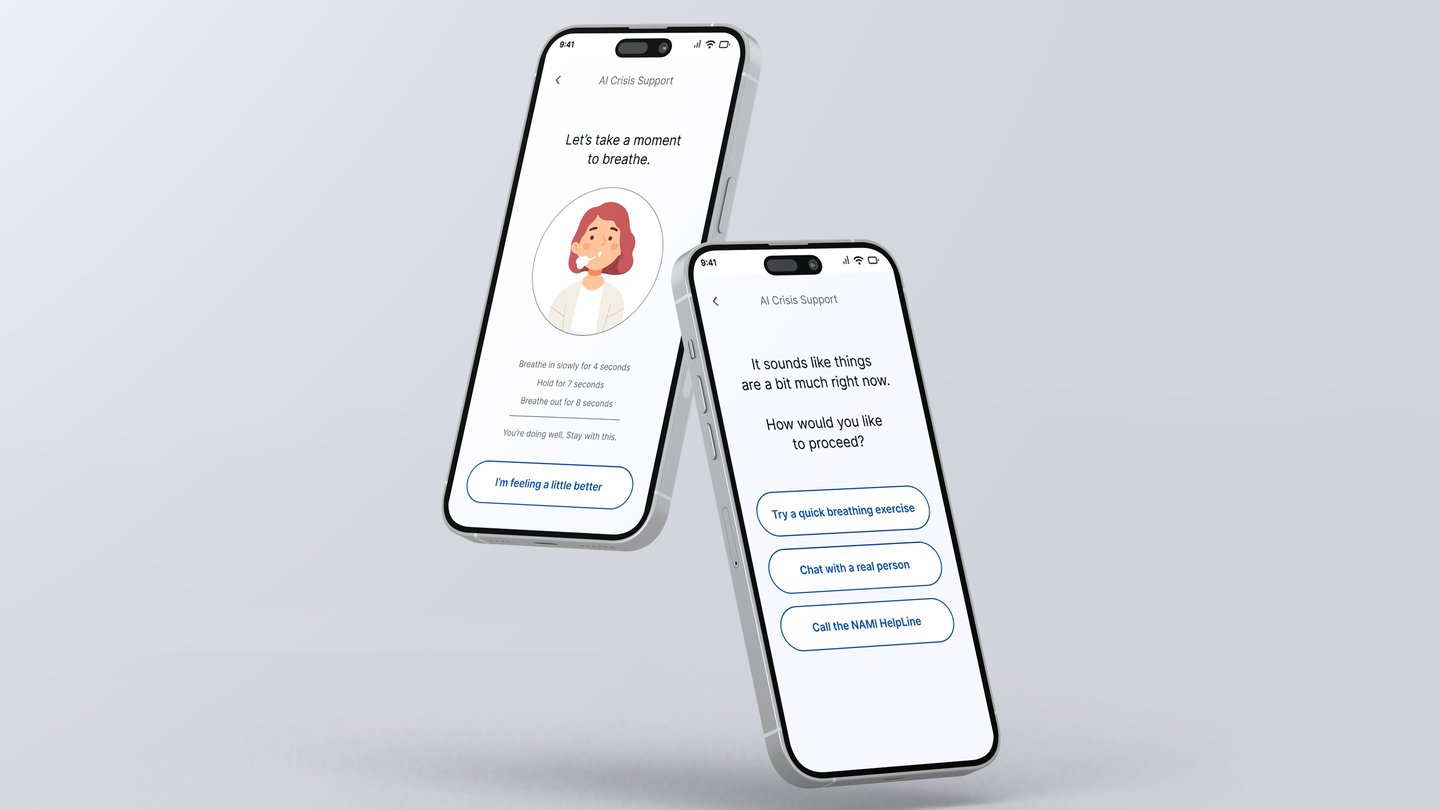
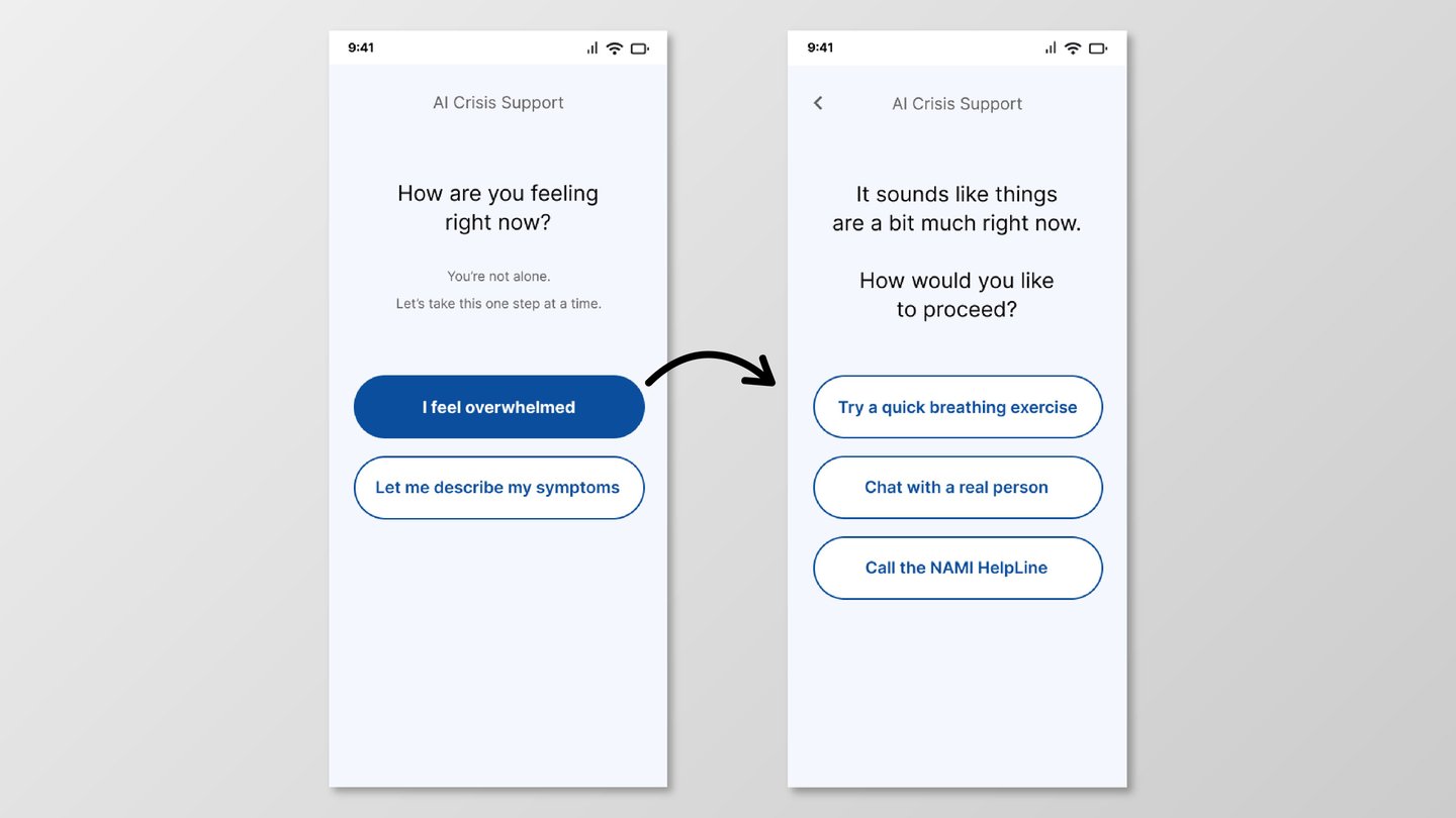
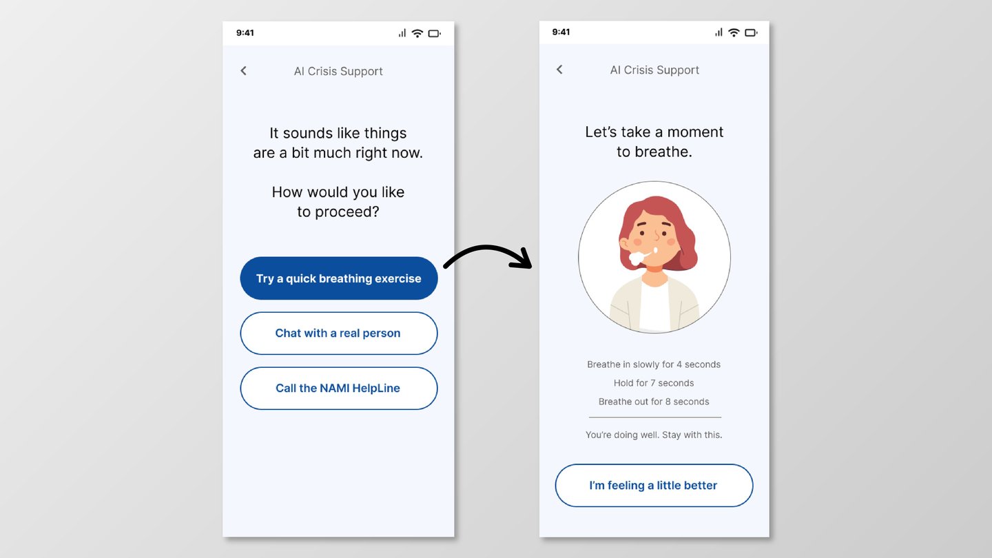
Rather than presenting a set of options and leaving users to navigate, the experience responds to their emotional state — offering a limited set of clear choices, each representing a different kind of support: self-regulation, human connection, or immediate crisis help.
The tone throughout is calm, warm, and unhurried. The goal was to design something that feels less like a product and more like a steady presence.
Key Concept - Guided, Low-Effort Decisions
The design principle at the heart of this project is radical simplicity in moments of need.
At each step, the user faces only one question and a small set of choices. There is no navigation to figure out, no content to parse, no searching required. The system does the orienting — the user only has to respond.
This shifts the experience from finding help to being gently led toward it — a distinction that matters enormously when someone is in distress.
Explore the live prototype here
Breathing Exercise
A guided, step-by-step breathing activity that gives users something concrete to do with their body while their mind is overwhelmed. Instructions are broken into the smallest possible steps, with language carefully chosen to reduce pressure and encourage continuation without urgency.
Reflection
This was the most ethically demanding project I've worked on, and the one that pushed my thinking furthest beyond aesthetics and usability.
Designing for someone in crisis means that the usual measures of good UX — efficiency, discoverability, feature depth — become almost irrelevant. What matters is whether the experience makes someone feel less alone in the first five seconds. Whether the language doesn't accidentally increase panic. Whether a confused or shaking user can still find the next step.
It made me think carefully about tone as a design material, about pacing as a UX tool, and about the ethics of building systems that operate in vulnerable moments. The hardest decisions weren't about layout — they were about what to say, and how to say it, to someone who really needs to hear it.
The User
The user is someone in the middle of an emotional crisis — anxious, overwhelmed, possibly frightened — reaching for their phone because they don't know what else to do.
They are not in a state to read paragraphs, evaluate options, or navigate complex menus. Their cognitive bandwidth is limited. Their need for reassurance is immediate.
Their core need is simple: to feel like something — or someone — is with them, and to be gently guided toward the next step, whether that's calming down, talking to someone, or getting emergency help.
Every design decision in this project flows from that need.
Entry Point
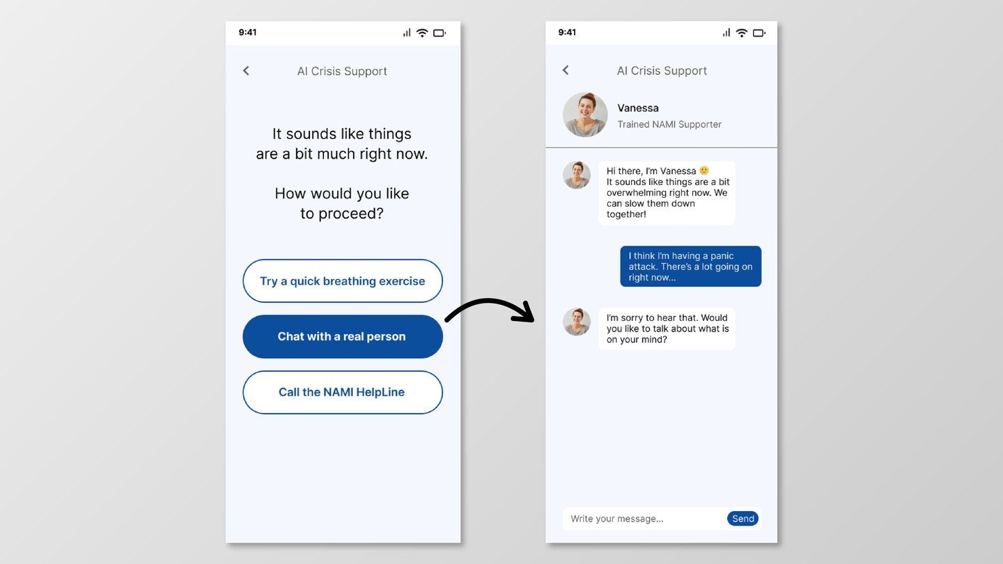
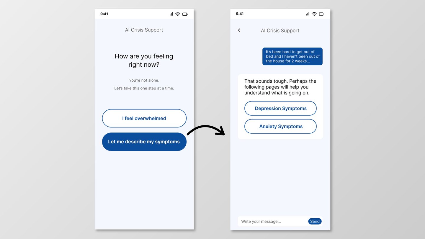
The flow opens not with options, but with a moment of acknowledgement — a simple, supportive question that signals to the user: you're not alone, and you don't have to figure this out yourself. Only then does the interface offer a small set of paths forward, letting users choose what feels right for where they are.
Chat with Supporter
A conversational interface connecting users with a trained supporter — designed to feel like a safe, unhurried space. The tone is empathetic and human, prioritizing feeling heard over efficiency.
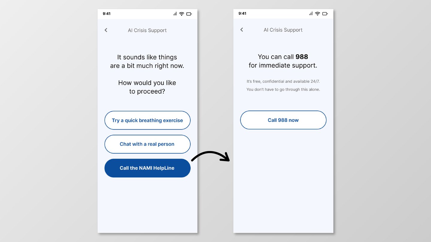
Nami HelpLine
A single-focus screen for users in immediate crisis. One message, one action, no distractions. Designed to make reaching out as frictionless as possible — because hesitation costs time that people in crisis don't always have.
Guided Resources
Once a user has been steadied, the flow gently introduces relevant educational content — connecting emotional support with understanding. Information arrives as a next step, not a first demand.
User Journey
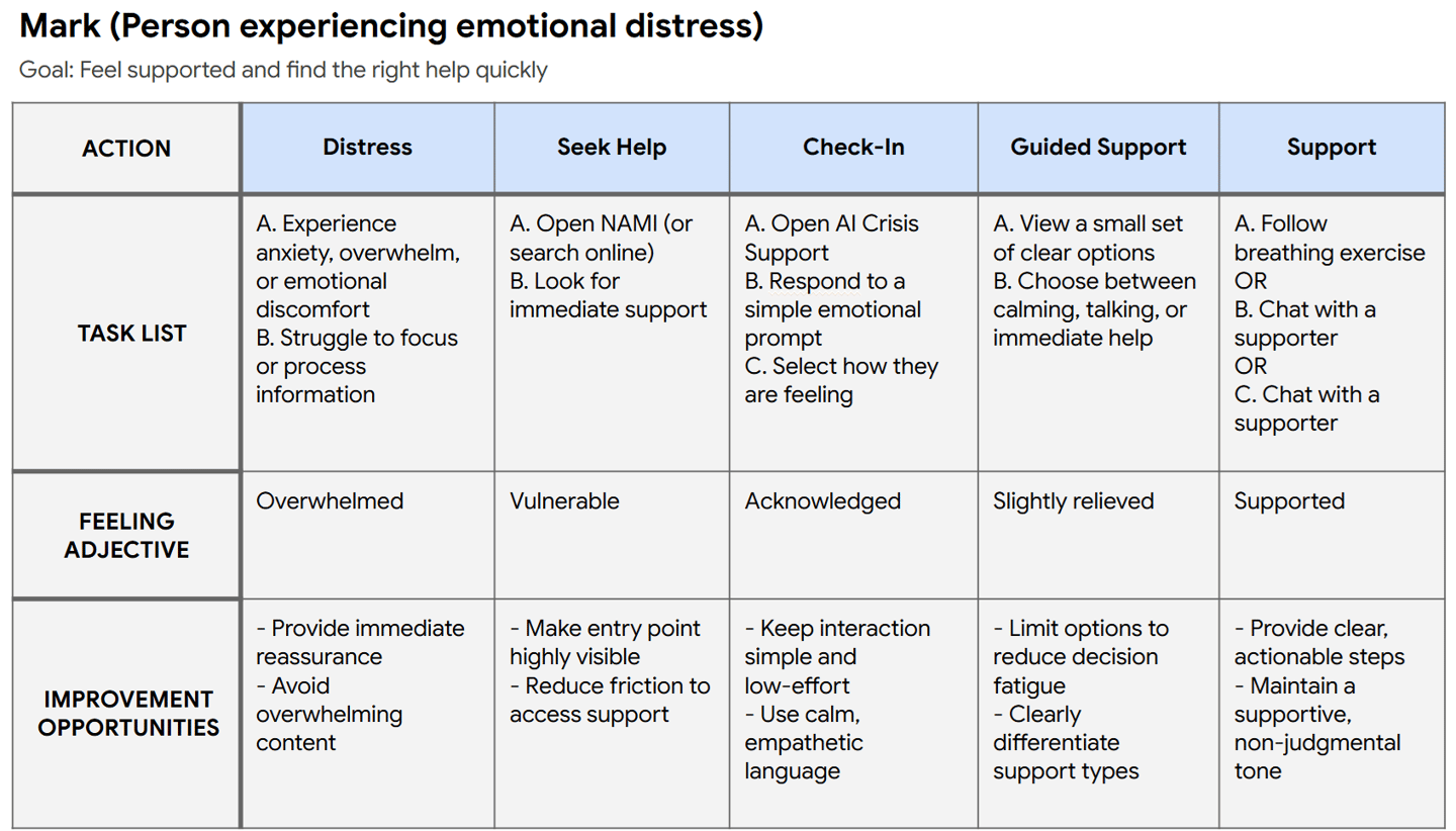
This journey maps the emotional arc of a user in distress — from the initial moment of overwhelm, through each guided interaction, to a place of greater calm or connection. It informed the pacing, tone, and structure of every screen in the flow.