Divemap (Live Product)
Designing for Clarity, Consistency & Scale
A real Greek diving platform needed a design foundation to match its ambitions — not a visual refresh, but a coherent system that could scale.


The Problem
Divemap had grown through iterations — features added as the platform expanded, each one solving an immediate need without reference to a shared design language. The result was a product that worked functionally but asked too much of its users.
Interaction patterns changed from screen to screen. Icons spoke different visual languages depending on which page you were on. Mobile users encountered controls designed for desktop tables — pagination selectors, per-page dropdowns, compound card titles that wrapped across two lines before showing the information being looked for. A first-time visitor couldn't be confident that what they'd learned on one screen would transfer to the next.
The friction wasn't catastrophic. But a platform built around community and discovery — one that depends on users coming back regularly to log dives, find sites, and browse trips — can't afford an interface that gets in the way of the thing it's supposed to be doing.
The Solution
The redesign focused on three things: establishing a consistent design system, replacing desktop-web conventions with mobile-native ones, and creating a clear visual hierarchy on every screen.
Rather than redesigning for visual novelty, every change was grounded in a specific usability problem identified in the audit or confirmed in conversation. The goal wasn't a different-looking Divemap — it was a more coherent one.
Key Concept - A Unified Design System
The most impactful decision was not a single screen change but a system-level one: establishing a consistent color, icon, typography, and component language that applies across every page. This was also the first decision made, because without it every subsequent screen change would have been solving a symptom rather than the cause.
One primary blue. A single brand blue (#1677FF) is used for all primary actions, active states, links, and key UI elements — replacing the scattered use of multiple blues, navys, and teals that coexisted without logic.
One icon style. All icons use the same outlined stroke style at the same weight, replacing a mix of filled, outlined, emoji-based, and multi-colored icons that gave each page a different visual personality.
One card pattern. Every list card — dive trip, dive site, diving center, or dive log entry — follows the same structure: title on the left, status badge on the right, metadata in a labeled grid below, "View Details →" in the footer. Users learn the pattern once and can scan every list in the platform.
One mobile navigation pattern. Load more replaces pagination. Segmented controls replace ambiguous status chips. Filter icons replace emoji rows. These patterns are applied consistently across all six list screens.
These four rules resolved more individual design questions than any other single decision in the project.
What Success Looks Like
Since this is a live product, the impact of these changes should be measurable. The metrics I'd prioritize to evaluate the redesign are:
Task completion rate for core flows: finding a dive site by location, and logging a dive from the dive log screen. Both are primary jobs-to-be-done that the original interface complicated unnecessarily.
Time on task for first-time users navigating the hamburger menu to find a specific section. The original flat list with no hierarchy made this a scanning exercise; the restructured version should reduce it significantly.
Bounce rate on the homepage, as an indicator of whether the single primary CTA successfully directs new visitors into the product rather than losing them to indecision.
Rating submission rate, as a proxy for whether the five-star system is more approachable than the shell emoji system it replaced.
The User
Two user types, one platform.
The primary user is a diver — recreational or technical — who uses Divemap to discover new sites, log their dives, browse community content, and find upcoming trips. They're often on mobile, before or after time in the water, and expect an interface that gets out of their way quickly.
The secondary user is the diving center operator, who lists services, creates trips, and connects with the community. For them, clarity of administrative actions matters as much as the browsing experience does for divers.
Both share one expectation: an app that works as fluently as the activity it supports.
Accessibility
Accessibility was treated as a design constraint, not an afterthought.
The primary blue (#1677FF) was evaluated for contrast ratios against white and against all companion colors in the interface. A secondary sky blue (#69B1FF) was selected specifically for its contrast against the primary blue, ensuring the two-tone palette remains distinguishable for users with deuteranopia, protanopia, and tritanopia.
The multi-color icon system — where each icon had an arbitrary background color with no semantic logic — was identified as a direct accessibility barrier and replaced with a single unified style throughout.
Star ratings replaced shell emoji ratings, removing reliance on a symbol with no universally understood meaning. Changing from a 10-point to a 5-point scale also reduced the cognitive precision required to assign a rating — which lowers the barrier for users with cognitive differences, not just those with visual impairments.
Homepage - Before
No clear primary action on the homepage meant users arrived without a natural next step. Three equal-weight buttons competed below the hero before users had formed an intent, making the first interaction a decision rather than an invitation. Feature cards carried four different icon colors with no semantic logic — a direct accessibility barrier for colorblind users, and a visual signal that the platform lacked a coherent design language. The statistics section used an off-brand dark navy that sat outside the color system entirely. The navigation bar was dominated by a full-width search bar, leaving no room for account or messaging functions as the platform grew.
Homepage - After
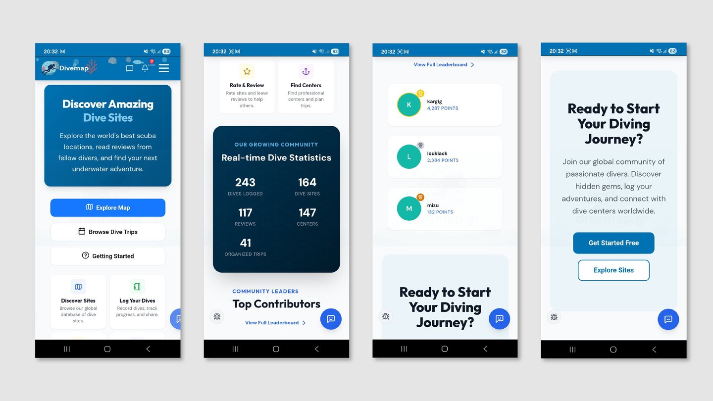
The three-button hero was reduced to a single “Browse Map” CTA. Feature cards were unified to one icon color, given explicit text links to signal interactivity, and kept as the secondary navigation layer rather than replacing them with buttons. The statistics section was rebuilt in primary brand blue with a 2×2 mobile grid, replacing the horizontal five-stat row that doesn’t work at small screen widths. The navigation bar gained search, messages, and account icons — made possible by moving search into the hamburger drawer as a prominent full-width field.
Two additional sections were added to the homepage to reflect the community dimension of the platform. A leaderboard section surfaces the top three contributors by points, giving the platform’s most active users visibility and giving newcomers a reason to engage. A live activity feed — “Community Pulse” — shows recent actions from the community in real time: new sites added, dives logged, reviews written. Rather than a raw activity log, entries are structured as avatar + plain-language action + relative timestamp, which keeps the feed readable at a glance without demanding attention.
Carousel - New Section
The original homepage used a static hero with a single illustration and one button. As the platform expanded to include verified diving centers, community-curated lists, and live activity, the hero needed to carry more without becoming cluttered.
The solution was a peek carousel — the dominant mobile-native pattern used by Airbnb, Spotify, and the App Store, where the active card occupies roughly 85–90% of the screen width and the edge of the next card peeks in from the right, signaling that more content exists without requiring a UI control to say so.
Three slides, three distinct content types:
Slide 1 — Hero CTA. The existing hero moves into the carousel. The underwater gradient, the “Discover Amazing Dive Sites” headline, and the single “Browse Map” CTA are preserved. A live ticker strip runs along the bottom of the card — a green dot and a single line of recent community activity (“kargig added a site · MMaresca logged 3 dives”) that communicates the platform is alive without dedicating a separate section to it above the fold.
Slide 2 — Daily feature. A card highlighting the most recently verified diving center: center name, location, rating, certification tags, and a “View Center” CTA. A “Newly Verified” badge and a “Today” chip make it feel timely rather than static. The content type can rotate — verified centers, newly added dive sites, highly rated recent additions — without the card structure changing. This was a deliberate choice: the design doesn’t depend on a specific content type, which keeps it useful as the platform grows.
Slide 3 — Featured list. Community-curated collections of dive sites or trips — the equivalent of a Spotify playlist, but for diving. The card shows the list title, the creator’s username, a preview of the first three items with their ratings, and a “View List” CTA. A deliberately darker card background gives this slide a distinct visual identity from the other two, so users immediately understand they’re looking at a different content type without reading the label.
The three slides were designed to feel coherent as a set — same height, same border radius, same dot indicator below — while each having its own visual personality that matches the content it carries.
A constraint worth noting: the carousel introduces a dependency on content availability. Slide 2 only works if a center has been recently verified; Slide 3 only works if curated lists exist and are publicly shared. Empty or stale slides would undermine the homepage more than a static hero would. This was flagged to the developer — the carousel should degrade gracefully, either falling back to a two-slide version or hiding a slide entirely when its content condition isn’t met.


Navigation Menu - Before
A flat list of 8+ items with no visual distinction between parent categories and sub-pages required users to scan every item on every visit. Login and Register appeared at equal weight with no hierarchy between them.
Navigation Menu - After
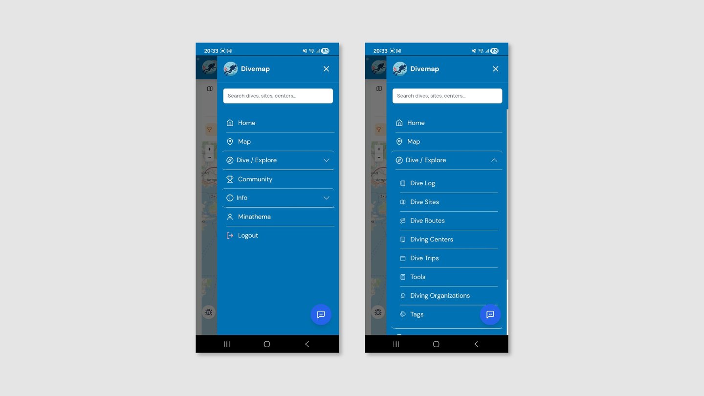
Five top-level items with collapsible sub-sections. Child items are visually anchored to their parent through background contrast and indentation. Chevrons communicate open and closed states. Register is the filled primary button; Login is the secondary outline — hierarchy reflects the desired action.


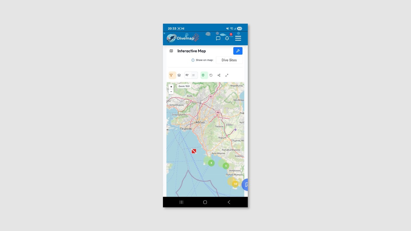
Map - Before
A title row and a selector row consumed the top of the screen before the map began. Seven unlabeled icons with arbitrary orange and green backgrounds gave users no way to predict what each control would do.
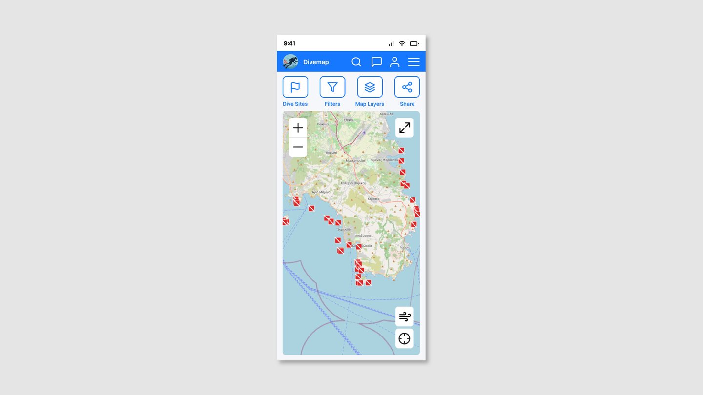
Map - After
Title and selector rows removed. Four labeled toolbar items replace seven unlabeled icons. Wind and location controls float over the map as dedicated buttons, following established map interaction conventions.
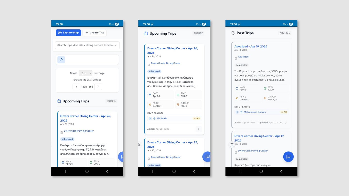
Dive Trips - Before
Card titles led with the diving center’s name rather than the destination, meaning users had to read to the second line before finding the information they were actually scanning for. FUTURE and ARCHIVE status chips borrowed from desktop table conventions that carry no meaning on mobile, desktop pagination interrupted the browsing flow with per-page selectors and page numbers, and two equal-weight CTA buttons at the top competed for attention with no hierarchy between them.
The filter panel mixed a fixed four-option difficulty selector with a “Min Rating (1–10)” text input that exposed a technical validation rule directly in the UI, ordered fields with no logic to frequency of use, and used uniform visual treatment across every control type — inputs, selectors, and toggles all looked the same.
Sort Field and Sort Order were two separate controls requiring users to mentally combine them into a single intended outcome. “Ascending” and “Descending” required translation rather than communicating direction plainly, and Compact Layout appeared as a checkbox visually identical to a filter option rather than a display preference.
Dive Trips - After
Cards lead with the dive destination name, Upcoming and Past are separated by a segmented control, and “Load More Trips” replaces pagination throughout. A single “+ New Trip” button sits alongside the page title, metadata icons are unified to primary blue, and a number badge gives users immediate context about how much content they’re browsing before they start scrolling.
In the filter panel, fields are reordered by frequency of use, Difficulty becomes a pill selector, Minimum Rating becomes a tappable star row, and Date Range combines start and end into a single row with presets and an expandable Custom option. Fields were designed modularly — consistent height and label style — so the same panel component works across Dive Trips, Dive Sites, Dive Log, and Diving Centers without the layout breaking.
In the sorting panel, Sort Field becomes a pill row and selecting one updates the Order control with contextual labels specific to that field — “Latest First / Earliest First” for Trip Date, “Longest First / Shortest First” for Duration — so users never have to translate an abstract direction label. Compact Layout becomes a clearly labeled toggle switch, and Reset is demoted to a text link that reflects how rarely it’s actually used.


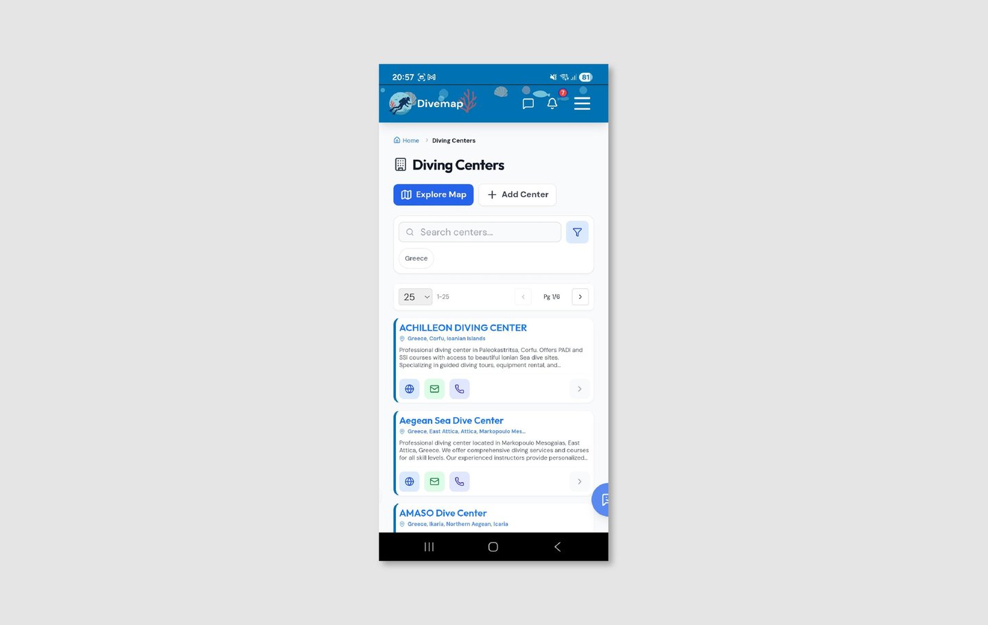
Diving Centers - Before
Inconsistent title casing across center names (some all-caps, some title case) created an impression of unmanaged data. Contact buttons in three different background colors added visual noise with no semantic meaning.
Diving Centers - After
All center names display in consistent title case, contact icons are unified to the outlined style, and a circular logo image was added to each card — giving users a visual anchor for centers they’ve seen before and making the list feel like a directory rather than a data dump. A single “+ New Center” button sits alongside the page title, with “View on Map” below it as a clearly secondary action. “Load More Centers” replaces pagination, and a count badge next to the page title gives users immediate context about the size of the directory they’re browsing.
The filter panel for Diving Centers reflects the way users actually search for a center: by location first, then by what the center offers. Country and Region/State appear at the top, followed by a Services field for filtering by certification type or available equipment. The panel uses the same modular structure as the Dive Trips filter — consistent field height and label style — so it reads as part of the same system despite carrying a completely different set of fields.


Dive Log - Before
Three action buttons stacked in the header with no clear priority meant every return visit to the dive log required the same visual parsing. Emoji-based filter icons rendered differently across devices and carried no labeled meaning.


Dive Log - After
Cards lead with the dive site name and show Max Depth and Duration alongside Date and Time — metadata that matters specifically to divers reviewing their own history, not just when the dive happened. Certification level appears as a colored inline badge so users can scan the difficulty profile of their log at a glance without opening individual entries. A “+ New Dive” primary button and an “Import Dives” secondary button replace the previous three-button header, and a “Ready to Start Your Diving Journey?” sign-up prompt at the bottom of the list gives non-registered users a conversion path without interrupting the browsing experience for logged-in users.
The filter panel reflects how a diver actually searches their own log: by site, by who they dove with, and by the characteristics of the dive itself. Dive Site, Creator, and Buddy appear first, followed by Difficulty as a pill selector, Minimum Rating as a tappable star row, and Date Range as a combined preset and custom field. The “Only show dives with difficulty set” toggle sits directly beneath the difficulty pills where its relationship to that field is immediately clear. The sorting panel carries fields specific to dive log data — Depth, Duration, Visibility, and Rating alongside Dive Date — and selecting any one updates the Order control with labels that describe the sort in plain terms rather than abstract direction words.


Dive Sites - Before
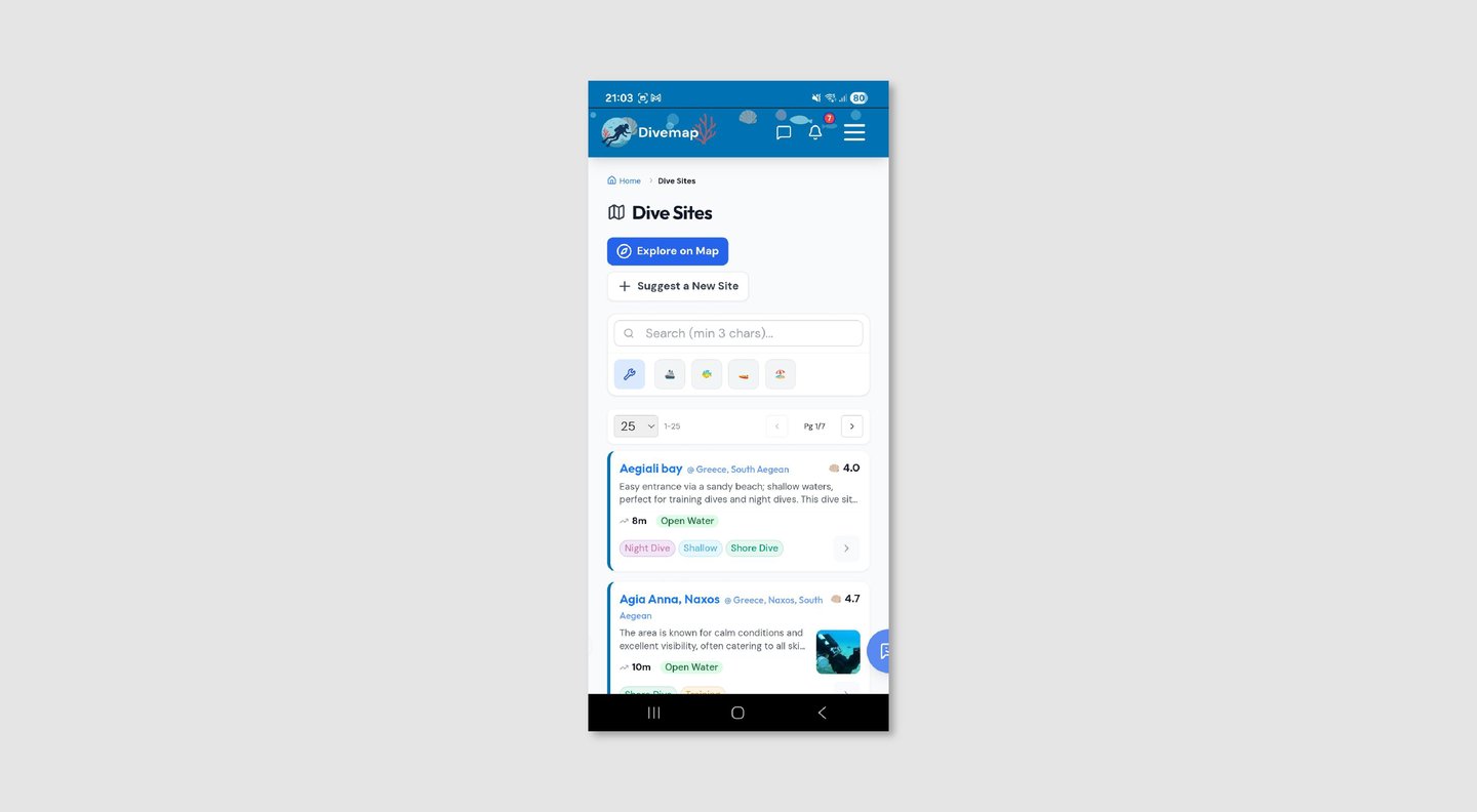
Cards mixed site name and location on the same line with an "@" separator, making both harder to read. Tags used arbitrary multi-color pills with no consistent system. The shell emoji rating with no scale reference asked users to interpret a symbol before reading a number.
Dive Sites - After
Cards lead with the site name in title case, with the certification level as an inline badge and location on its own line — separating the three pieces of information into distinct visual roles rather than running them together. Max Depth appears as the key metric in the card body, accompanied by the star rating in a teal pill, and dive type tags (“Night Dive”, “Shallow”) sit in the footer alongside “View Details →”, making the card’s interactivity explicit. A count badge next to the page title shows the full size of the directory at a glance, “Load More Sites” replaces pagination, and “View on Map” sits below the “+ New Site” button as a secondary action available without competing for hierarchy.


Reflection
Working on a live product is a different discipline from designing from scratch. The constraints are real — existing data structures, an established user base, a developer whose priorities don't always align with design ideals, and a codebase that can't be thrown away because the design system has changed.
The navigation is the clearest example of this. I identified it as a high-friction area and proposed a restructure that I believe would meaningfully improve the experience for new users especially. The stakeholder chose to retain the current structure. That's a legitimate outcome — design recommendations aren't always implemented, and knowing how to make a case, accept a decision, and move on is part of the job. The screens reflect my proposed direction, and the conversation about navigation remains open.
The breadcrumb situation taught me something more nuanced: not every desktop convention that appears on mobile is a mistake. Sometimes it's a trade-off. SEO value for a platform that lives or dies by discovery is not an aesthetic concern — it's a business concern that a designer working on a real product has to weigh. The right answer wasn't "remove the breadcrumbs because mobile convention says so" — it was "keep them, acknowledge the tension, and make sure they're as visually quiet as possible."
What comes next: the design system established here is intended to scale. New screens, new features, and new content types should slot into the existing patterns without requiring another audit. The immediate priority I'd recommend is applying the same system review to the authenticated screens — account, profile, and messaging — which weren't in scope for this phase but carry the same inconsistencies the six redesigned screens had before this work.
This is an ongoing project. Screens shown reflect the redesign as of October 2026.
Research & Audit
I conducted a screen-by-screen audit of the existing experience — homepage, navigation, map, dive sites, dive trips, diving centers, and dive log — cataloguing every instance where the interface contradicted itself or borrowed conventions that didn't belong on mobile.
To complement this, I ran four short informal interviews (20–30 minutes each) with people in my network with diving experience: two recreational divers who use similar platforms, one diving instructor, and one diving center employee. These weren't formal research sessions but structured conversations focused on how they currently discover dive sites, plan trips, and log their dives.
Key things I heard:
"I just scroll through until something looks interesting — there's no obvious starting point." — No clear hierarchy of actions meant users defaulted to passive browsing rather than directed discovery.
"I can never remember if I need to tap the icon or the text — they don't always both work." — Inconsistent interactive affordances eroded trust in the interface over repeated use.
"I close the app and Google it instead." — When the friction of navigating a list exceeded the effort of leaving the platform entirely, users left. The most telling feedback isn't what people say about the interface — it's what they do instead.
Design Principles
Three principles shaped every decision in the redesign:
Mobile-native over desktop-adapted. The platform is a website experienced as a mobile app. Every convention borrowed from desktop — pagination, compound card titles, search bars dominating the nav — was evaluated against how it would perform at 390px width and replaced with a mobile-appropriate equivalent.
One semantic system over many decorative choices. Color, icon style, and card structure are not aesthetic preferences in this product — they are communication tools. Every divergence from the system creates a question in the user's mind about whether the divergence means something. It shouldn't.
Familiar over invented. Where a universal convention exists — star ratings, load more patterns, floating map controls — it was used rather than replaced with something original. Cognitive load spent learning a custom pattern is cognitive load not spent on discovering a dive site.
Design Decisions
Homepage: removing the competition
Three equal-weight buttons below the hero meant users landing on the homepage faced a decision before they'd formed an intent. There was no clear answer to "what should I do first?" — and when everything is equally important, nothing is. The redesign reduced this to one primary CTA ("Browse Map") with feature cards below serving as a navigable secondary layer. Users with a specific goal can act immediately; users who are exploring have a clear invitation to do so.
Navigation: a stakeholder constraint
The hamburger menu held 8+ items in a flat list with no hierarchy between parent and child levels. I proposed restructuring it into five top-level items with collapsible sub-sections, rotating chevrons to communicate state, and visual anchoring of sub-items to their parent through indentation and background contrast. This was implemented in the redesigned screens. However, the platform owner and developer preferred to retain the current navigation structure — so this remains a proposed direction that may be revisited in a future collaboration, rather than a confirmed change.
Breadcrumbs: a deliberate exception
Breadcrumbs are unusual on mobile — they create visual noise and are rarely how mobile users navigate back. However, Divemap is a website experienced as a mobile app, not a native application. Removing breadcrumbs would have cost the platform meaningful SEO value for its dive site pages, which are indexed individually by country and region. They were kept as a conscious trade-off between mobile UX convention and a legitimate business need.
Map: give the map the screen
A title row and a selector row consumed screen real estate before the map even began — the product's most spatially distinctive feature was competing with its own UI chrome for space. Removing both rows and consolidating controls into a labeled four-item toolbar gave the map the screen it needed. Wind and location controls moved to floating buttons overlaid on the map itself, following the convention established by Google Maps and Apple Maps so users didn't have to learn a new pattern.
Cards: lead with what users are looking for
Dive trip cards titled "Diving Center Name — Date" put the organizer before the destination — but users browsing trips are primarily asking "where can I dive?" not "who is running it?" Restructuring the card hierarchy to lead with the dive destination immediately answered the question users were actually asking before they had to read further.
Rating system: universal over custom
A shell emoji with an unlabeled number required users to understand two things simultaneously: what the shell represents and what scale the number is on. A five-star rating with the score (★ 4.2) communicates both through a single universally understood convention. The scale also changed from 10-point to 5-point — a 10-point scale implies a granularity of judgment that users don't actually apply, and numbers like 6.5 read as negative to anyone conditioned by school grading systems.
Pagination: scrolling is native, page-jumping isn't
Desktop-style pagination with per-page selectors on a mobile list asked users to think about data management rather than content discovery. "Load More" is native to how mobile users expect to consume lists — it requires no decision, no mental model of pages, and keeps the user in the flow of browsing rather than pulling them out of it.