Divemap (Ongoing)
Designing for Clarity, Consistency & Scale
A UX redesign of a real Greek diving platform, covering mobile app and desktop website experiences — focused on building a consistent design system, reducing cognitive load, and improving usability across six core screens.
The Problem
Divemap had been built iteratively, with features added over time without a unified design language to hold them together.
Each screen had its own logic for spacing, color, icons, and interaction patterns — meaning users had to relearn the interface as they moved through the app. Controls borrowed from desktop web conventions felt out of place on mobile. Icons used different colors, styles, and sizes across pages. Navigation was crowded and unclear.
The platform worked functionally, but the experience communicated a product still finding its identity rather than one built with the user at its center.
The Solution
The redesign focused on three things: establishing a consistent design system, replacing desktop-web patterns with mobile-native ones, and creating clear visual hierarchy on every screen.
Rather than redesigning for visual novelty, every change was grounded in a specific usability problem from the current experience. The result is a product that feels coherent, accessible, and intentional — while remaining recognisably Divemap.
Key Concept - A Unified Design System
The most impactful decision was not a single screen change but a system-level one: establishing a consistent color, icon, typography, and component language that applies across every page.
One primary blue. A single brand blue (#1677FF) is used for all primary actions, active states, links, and key UI elements — replacing the scattered use of multiple blues, navys, and teals that previously coexisted without logic.
One icon style. All icons across all pages now use the same outlined stroke style at the same weight, replacing a mix of filled, outlined, emoji-based, and multi-colored icons that gave each page a different visual personality.
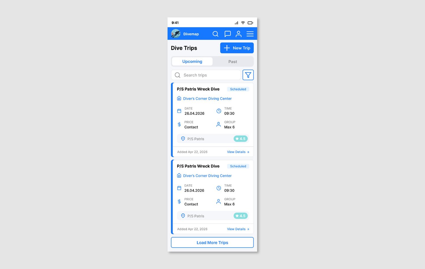
One card pattern. Every list card — whether a dive trip, dive site, diving center, or dive log entry — follows the same structure: title on the left, status badge on the right, metadata in a labeled grid below, and a "View Details →" link in the footer. Users learn the pattern once and can scan every list in the app.
One mobile navigation pattern. Load more buttons replace page pagination. Segmented controls replace FUTURE/ARCHIVE labels. Filter icons replace emoji-based filter rows. These patterns are applied consistently across all six list screens.
Design Decisions
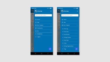
Navigation bar. The full-width search bar that previously dominated the nav bar was replaced by a search icon, freeing space for a messages icon and an account icon. Search moved into the hamburger drawer where it sits as a prominent full-width field at the top. This change made the nav bar functional rather than decorative.
Hamburger menu. The drawer was restructured from a flat list of 8+ items into a clear hierarchy: 5 top-level items, with dropdowns revealing sub-pages. Items without sub-pages show no chevron. Items with sub-pages show a rotating chevron that communicates state. The expanded section uses a darker background to anchor sub-items visually to their parent.
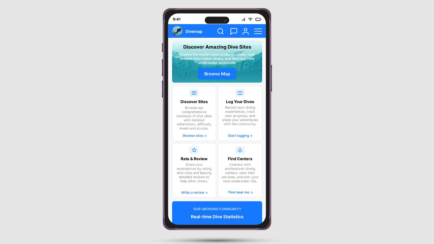
Hero section. Three equal-weight buttons below the hero were reduced to one. "Browse Map" became the single primary CTA. The four feature cards below it — previously passive and visually inconsistent — were given unified blue icons, text link affordances, and hover states, making them the secondary navigation layer they were always intended to be.
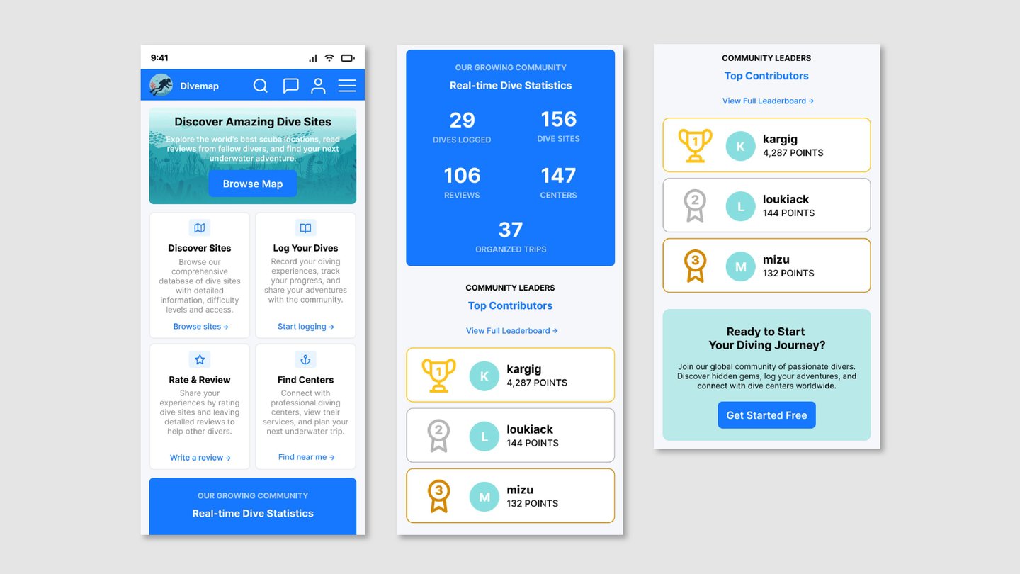
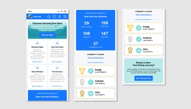
Statistics section. The off-brand dark navy background was replaced with the primary brand blue. The layout moved from a horizontal five-stat row — which doesn't work on mobile — to a 2×2 grid with the fifth stat centered below, a clean and scalable mobile layout.
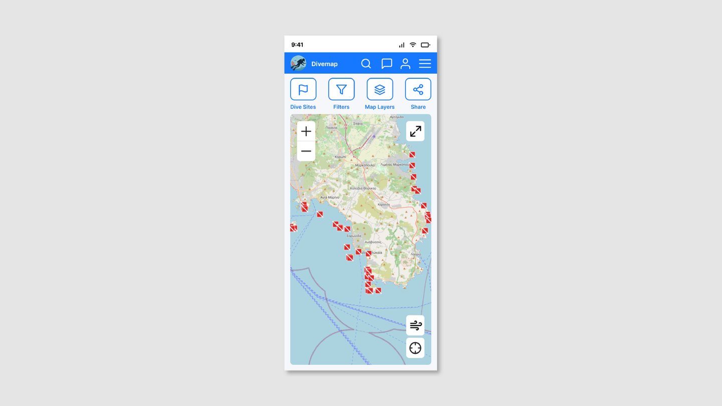
Map page. The "Interactive Map" title row and the separate "Show on map" selector row were eliminated, giving the map itself the screen space it deserves. All controls were consolidated into a single four-item labeled toolbar. Wind and location controls moved to floating buttons overlaid on the map, following the established convention of Google Maps and Apple Maps.
Rating system. The shell emoji with an unlabeled number was replaced by a star icon and score (★ 4.2) on a 5-point scale. The star carries its scale implicitly through universal convention — no label, no fraction, no ambiguity.
The User
The primary user is a diver — recreational or technical — who uses the platform to discover new sites, log their dives, find certified diving centers, or plan upcoming trips. They are often browsing on mobile, before or after time in the water, and expect the interface to get out of their way quickly.
A secondary user is the diving center operator, who uses the platform to list their services, manage trips, and connect with the community. For them, clarity of administrative actions — adding a center, creating a trip — matters just as much as the browsing experience does for divers.
Both users share one expectation: an app that works as fluently as the activity it supports.
Accessibility
Accessibility was a primary consideration from the start, not an afterthought.
The primary blue #1677FF was evaluated for contrast ratios against white and against all companion colors used in the interface. A secondary sky blue #69B1FF was selected specifically for its contrast against the primary blue, ensuring the two-color palette remains distinguishable for users with deuteranopia, protanopia, and tritanopia.
The multi-color icon system used across the original interface — where each icon had a different background color with no semantic logic — was identified as a direct accessibility barrier for colorblind users and replaced with a single unified color throughout.
Star ratings replaced shell emoji ratings, eliminating reliance on a custom symbol with no universally understood meaning. The rating scale was also reconsidered from 10-point to 5-point — a 10-point scale creates false precision and makes scores like 6.5 feel negative to users conditioned by school grading systems, while a 5-point star scale is immediately and universally understood.
Homepage - Current Experience
Three equal-weight buttons compete for attention below the hero, giving users no clear primary action. Feature cards use four different icon colors with no semantic logic and show no interactivity signals. The statistics block uses an off-brand dark navy. The nav bar is dominated by a full-width search bar with no room for account or messaging functions.

Homepage - Redesign
A single "Browse Map" button anchors the hero. Feature cards are unified to one icon color and carry explicit text links. The statistics block uses the primary brand blue in a clean 2×2 grid. The nav bar gains search, messages, and account icons as search moves into the drawer.
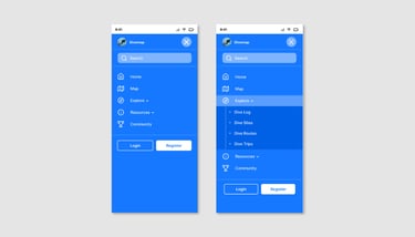
Navigation Menu - Current Experience
The Explore dropdown contains 8 sub-items with no visual hierarchy between parent and child levels. All items are separated by identical dividers creating a flat, undifferentiated list. Login and Register appear as equal-weight buttons. No visual separation exists between navigation items and account actions.

Navigation Menu - Redesign
Explore is reduced to 4 core sub-items. Child items appear on a darker background with a left border connecting them to their parent. Chevrons rotate to communicate open and closed states. Register is a filled white button; Login is a ghost outline. Account actions are separated from navigation by a clear visual divider.

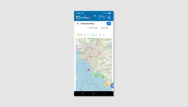
Map - Current Experience
A title row and a "Show on map" selector row consume the top of the screen before the map begins. Seven unlabeled icons in a toolbar use arbitrary orange and green backgrounds with no consistent logic. Decorative nav bar animations partially obscure the notification badge. A debug zoom level label is visible on the map surface.
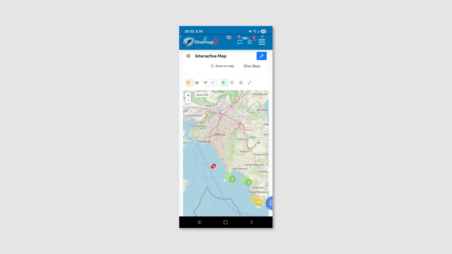
Map - Redesign
The title and selector rows are removed entirely. Four labeled toolbar items replace seven unlabeled icons, all in a consistent outlined style. Wind and location controls float over the map as dedicated buttons. The nav bar is clean and fully functional with all icons unobstructed.
Dive Trips - Current Experience
Card titles follow the format "Diving Center Name — Date", wrapping to two lines and burying the actual trip content. FUTURE and ARCHIVE labels are small, ambiguous chips borrowed from desktop web tables. Desktop-style pagination with a per-page dropdown appears on a mobile list. Metadata icons use four different colors with no system.
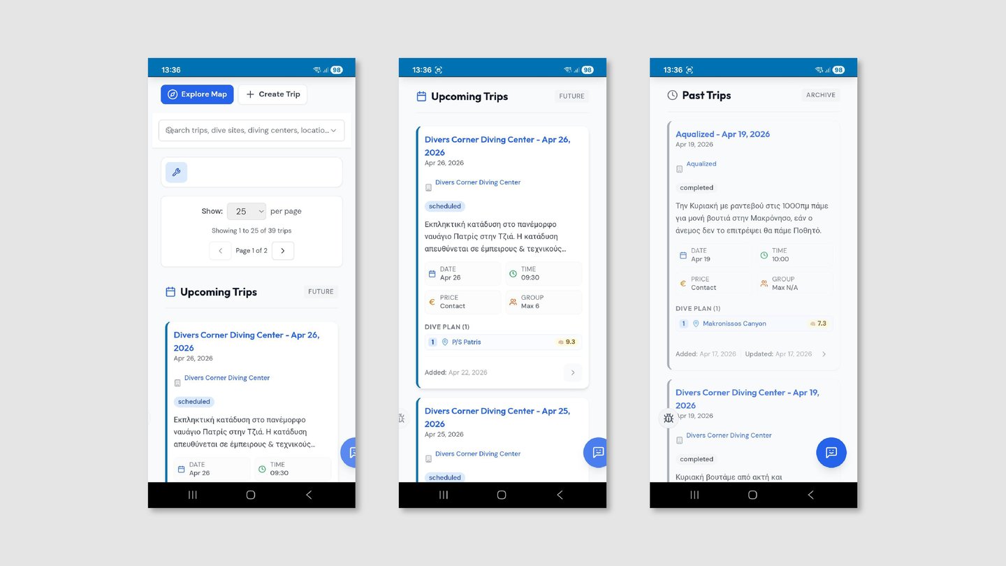
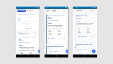
Dive Trips - Redesign
Cards lead with the dive destination name. Upcoming and Past trips are separated by a segmented control. "Load More Trips" replaces pagination. All metadata icons are unified to primary blue. "View Details →" replaces the ambiguous arrow.
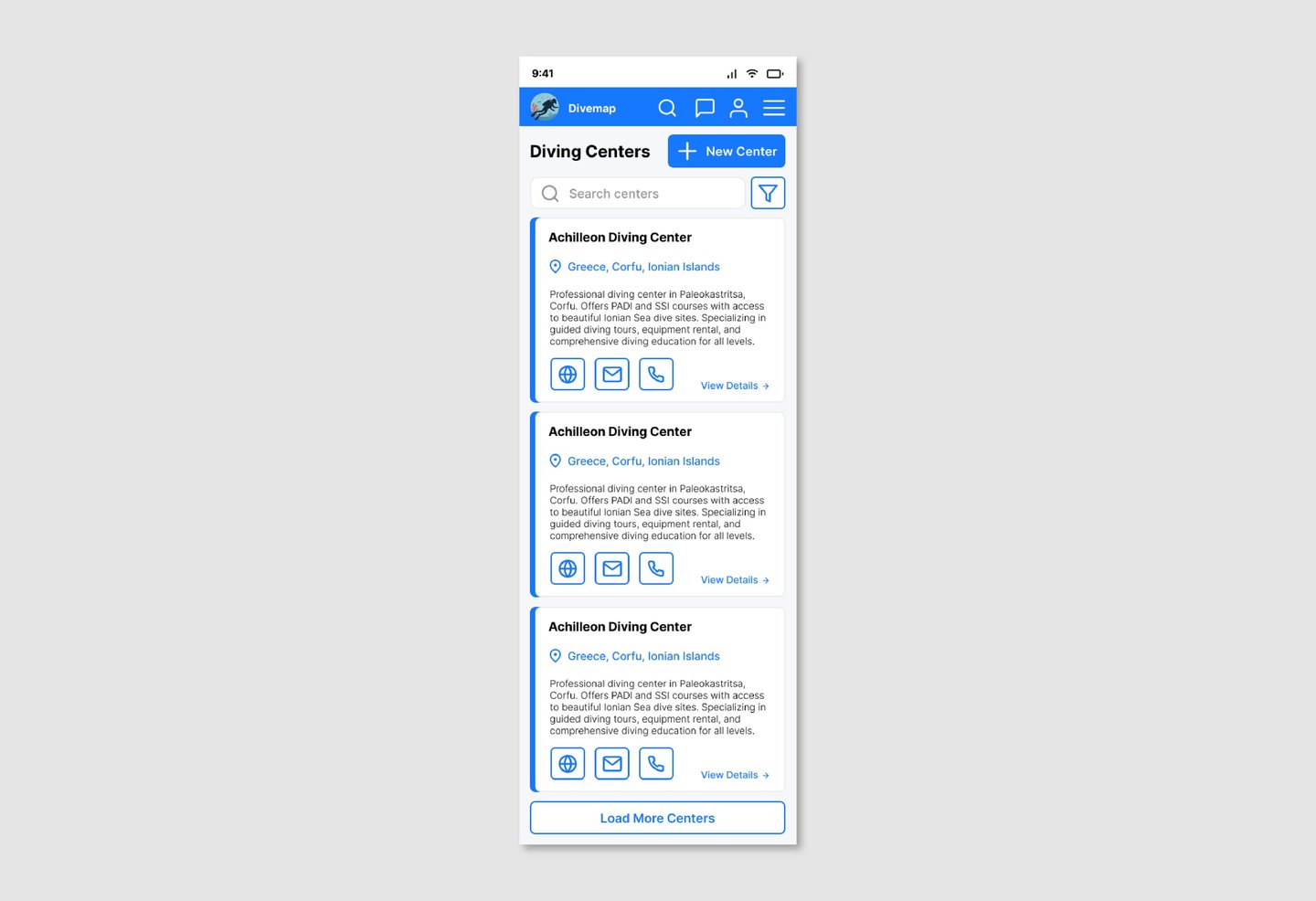
Diving Centers - Current Experience
Card titles are inconsistently cased — some in all-caps, some in title case. Contact action buttons use three different background colors. Desktop pagination appears at the bottom of the list. A breadcrumb row sits beneath the nav bar. Two unequal full-width buttons compete at the top of the page.
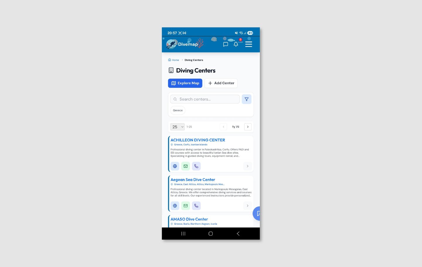
Diving Centers - Redesign
All center names display in consistent title case. Contact icons share a unified outlined style. "Load More Centers" replaces pagination. The breadcrumb is removed. A single "+ New Center" button sits alongside the page title with clear hierarchy.
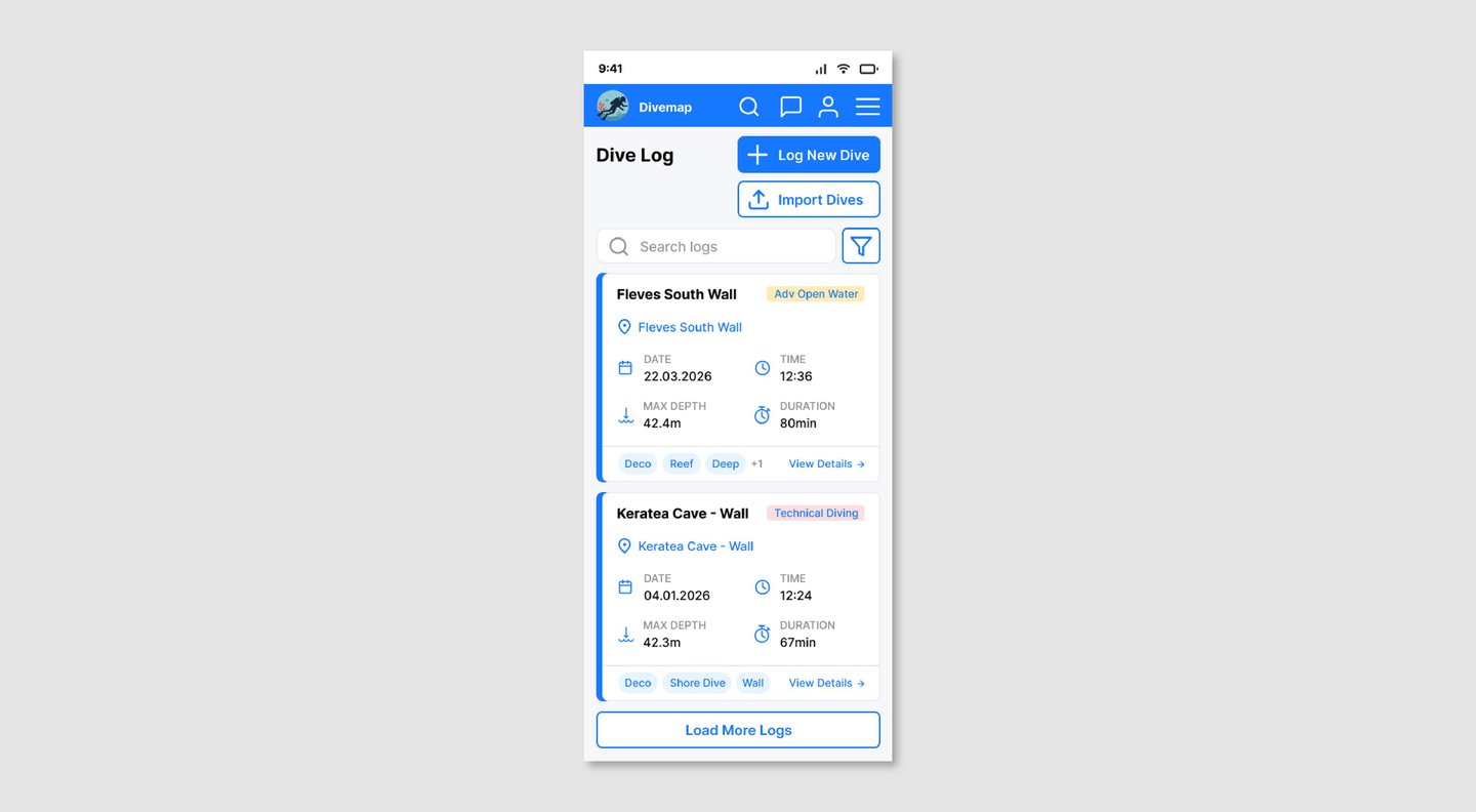
Dive Log - Current Experience
Three action buttons are stacked in the header with no clear hierarchy. Card titles repeat the site name, date, and dive number in a compound format that wraps to two lines. Emoji-based filter icons are inconsistent across devices and carry no labelled meaning. Desktop pagination with 10 pages of results forces page-by-page navigation through personal history.
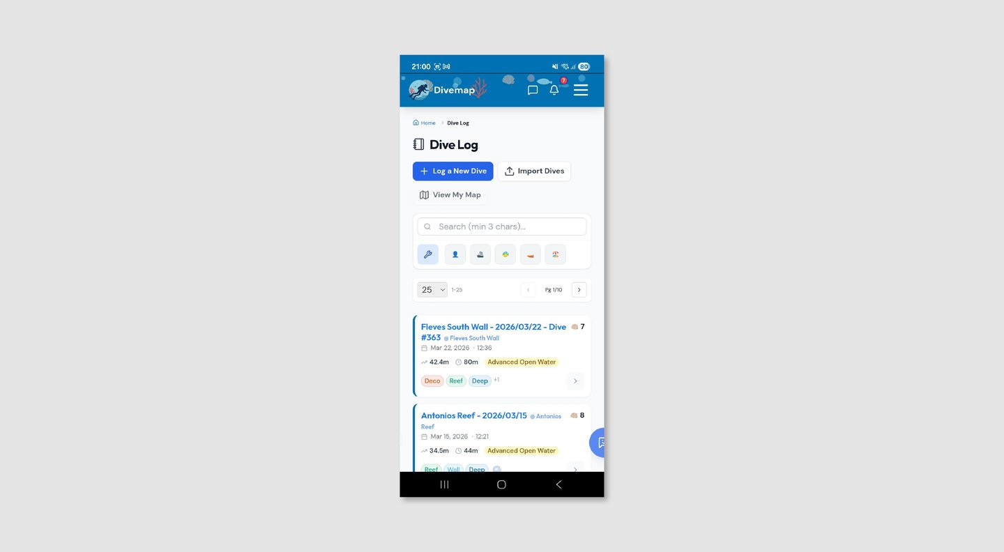

Dive Log - Redesign
One primary "+ Log New Dive" button and one secondary "Import Dives" button replace the three-button header. Card titles show only the site name. Emoji filters are replaced by a single filter icon. "Load More Logs" replaces pagination. Certification level appears as an inline badge. Dive tags are unified to a single outlined style.

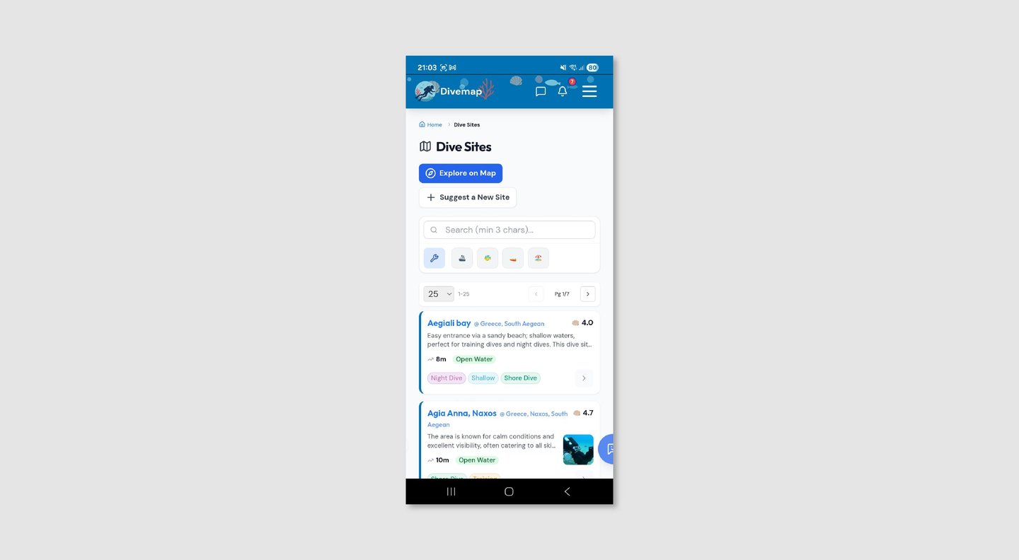
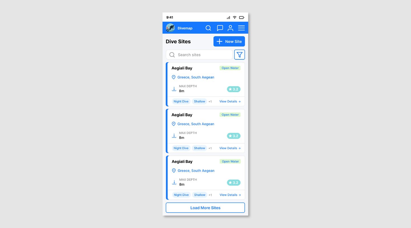
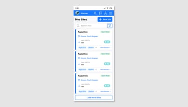
Dive Sites - Current Experience
Two separate full-width buttons of unequal weight sit at the top of a browsing page. The search placeholder exposes a technical validation constraint. Five emoji-based filter icons provide no labelled meaning. Cards mix site name and location on the same line with an "@" separator. Tags use arbitrary multi-color pills. Ratings use a shell emoji with no scale reference.
Dive Sites - Redesign
A single "+ New Site" button sits alongside the page title. Search placeholder is clean and user-facing. A single filter icon replaces the emoji row. Site name and location are clearly separated. Tags use a consistent outlined pill style. Ratings display as ★ 4.2 on a universally understood 5-point scale.
Reflection
This project taught me what it means to design for a real product with real constraints — existing data, established features, and a codebase that cannot be thrown away and started fresh.
The most challenging part was not identifying problems — there were many — but deciding which ones to solve and in what order. A redesign that tries to change everything at once risks losing the product's identity and creating more disruption than value. The approach here was surgical: fix what creates friction, preserve what works, and build a system that makes future decisions easier.
Working across both a mobile app and a desktop website also reinforced how differently the same information needs to be presented depending on context. Pagination that feels natural in a desktop table is jarring on a mobile scroll. A search bar that earns its place in a wide nav bar becomes a liability when the screen is 390px wide.
The accessibility work was also a reminder that good design is not just about aesthetics — choosing colors that work for colorblind users, selecting universally understood icons, and building rating systems that communicate clearly regardless of context are all design decisions with real consequences for real people.
Divemap is still growing. The design system established here is intended to scale with it — new screens, new features, and new content types should slot into the existing patterns without requiring another full redesign.
This is an ongoing project. Screens shown reflect the redesign as of April 2026.