Fleetora
A B2B SaaS Platform for Predictive Fleet Risk Management
Fleet managers spend too much time reacting to problems. Fleetora gives them the clarity to act before breakdowns happen — turning complex vehicle data into a clear, prioritized picture of risk.


The Problem
The design challenge was clear:
How might we help fleet operations managers identify and act on vehicle risk before failures occur — without increasing the cognitive load of an already data-heavy role?
This led to three design requirements:
A single risk signal. One number that aggregates vehicle health across multiple data points, so priority is immediately clear without interpretation.
A structured triage workflow. Detection, understanding, and action need to be one connected flow — not separate tools that force the manager to do the connective work.
Context at every step. Every screen should answer not just "what" but "so what" — what does this mean, and what should I do next.
The User
The primary user is a Fleet Operations Manager responsible for monitoring around 100–150 vehicles across multiple regions.
Their job isn't to interpret raw telemetry — it's to make fast, informed decisions based on system data. Every morning they're asking three questions: what's urgent right now, which vehicles need action today, and what do I need to schedule this week. They need a system that does the synthesis for them — presenting conclusions, not numbers.
Key characteristics:
High decision frequency, limited decision time
Accountable for both operational continuity and cost outcomes
Not a technical user — needs context and direction, not raw metrics
Works across multiple tools and communication channels simultaneously
The Solution
Fleetora translates vehicle telemetry into a prioritized risk hierarchy. Rather than overwhelming users with raw metrics, it surfaces what matters most — and connects detection directly to action.
The platform is built around a single core workflow: see what's at risk → understand why → schedule service. Every screen exists to advance that loop. Navigation reflects the natural order of a manager's day, but each page is fully self-contained — because real usage is non-linear and every entry point needs to work independently.
Key Concept - Risk Score
The Fleet Risk Score is the conceptual centre of the product — the answer to the research finding that risk knowledge exists but never reaches the right person in a usable form.
Each vehicle receives a score from 0 to 100, calculated from a weighted combination of health metrics: oil and fluid levels (25%), brake and battery health (30%), engine temperature (20%), mileage since last service (15%), and route intensity (10%). Scores for overall fleet health fall into three zones — Low (0–33), Moderate (34–66), and High (67–100). However, scores for individual vehicle health, as well as individual vehicle component health, are each mapped to a severity label: Healthy (0-40), Predictive (41–60), Warning (61–79), and Critical (80–100). These labels appear consistently throughout the product wherever vehicle risk is surfaced, creating a shared language between the score and every other view.
At the fleet level, the score is the mean of all vehicle scores — a single number reflecting the health of the entire operation in real time.
Instead of asking "What does all this data mean?", the system answers "Which vehicle needs attention first?"


Dashboard
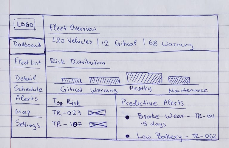
A real-time overview organized around the manager's morning question. Stat cards, a fleet health distribution bar, a critical alerts strip, live fleet status, a 7-day risk trend, and weekly alert activity — each answering a distinct part of the picture without overlapping.
Explore the live prototype here
Fleet List
All vehicles sorted by risk score by default. A subtle left-border accent marks Critical rows so severity is scannable before reading any badge. Quick actions include both View and Plan for vehicles at actionable severity levels.
Vehicle Details
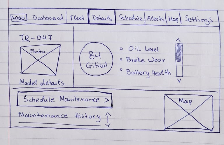
Three columns: vehicle metadata, risk score and analysis, health metrics. The risk score is displayed as a semicircular gauge with zone markers and a 7-day trend. Four health metrics on the right — Oil, Battery, Brake, Engine — each show current reading, trend, and a plain-language interpretation of what it means operationally.
Alerts Log
Active and Resolved as tabs, defaulting to Active, sorted by date. The full description column distinguishes this page from the compact alert strip on the dashboard. The summary chips include the Fleet Risk Score as context alongside the severity counts.
Service Planner
A weekly calendar where rows are vehicles and events are scheduled services. Severity is readable across the calendar at a glance from the left-border accent on each event. Two modal interactions — Add Service (2nd screen) and Service Info (3rd screen).
Map
Vehicle positions as callout bubbles with severity-colored anchor dots. Clicking a pin opens a compact card with severity, risk score, driver, status, and region — the minimum needed to decide whether to act. A severity legend and vehicle count chip give context to what's visible in the current view.


Reflection
Fleetora taught me that clarity in a product almost always comes from subtraction.
The decisions I'm most confident in aren't the features I added — they're the ones I didn't. Keeping the dashboard focused on a single question, separating active from resolved alerts rather than filtering them, defaulting to risk-based sorting rather than leaving that choice to the user. Each of these is a small structural decision that shapes how the product behaves before the manager makes any choice at all.
Working across six interconnected pages also reinforced how much consistency depends on underlying logic rather than visual similarity. The tinted badge, the filter chip, the modal structure — these aren't aesthetic choices. They're decisions that, once made, scale across the product without needing to be re-made. A manager who learns the system on the dashboard already understands it on the Fleet List, the Alerts Log, and the Service Planner. That transferability is what makes a product feel coherent rather than just well-designed.
From Structure to Interface
Early wireframes were used to define layout, information hierarchy, and how data should be prioritized across the system — before any visual decisions were made.
User Journey
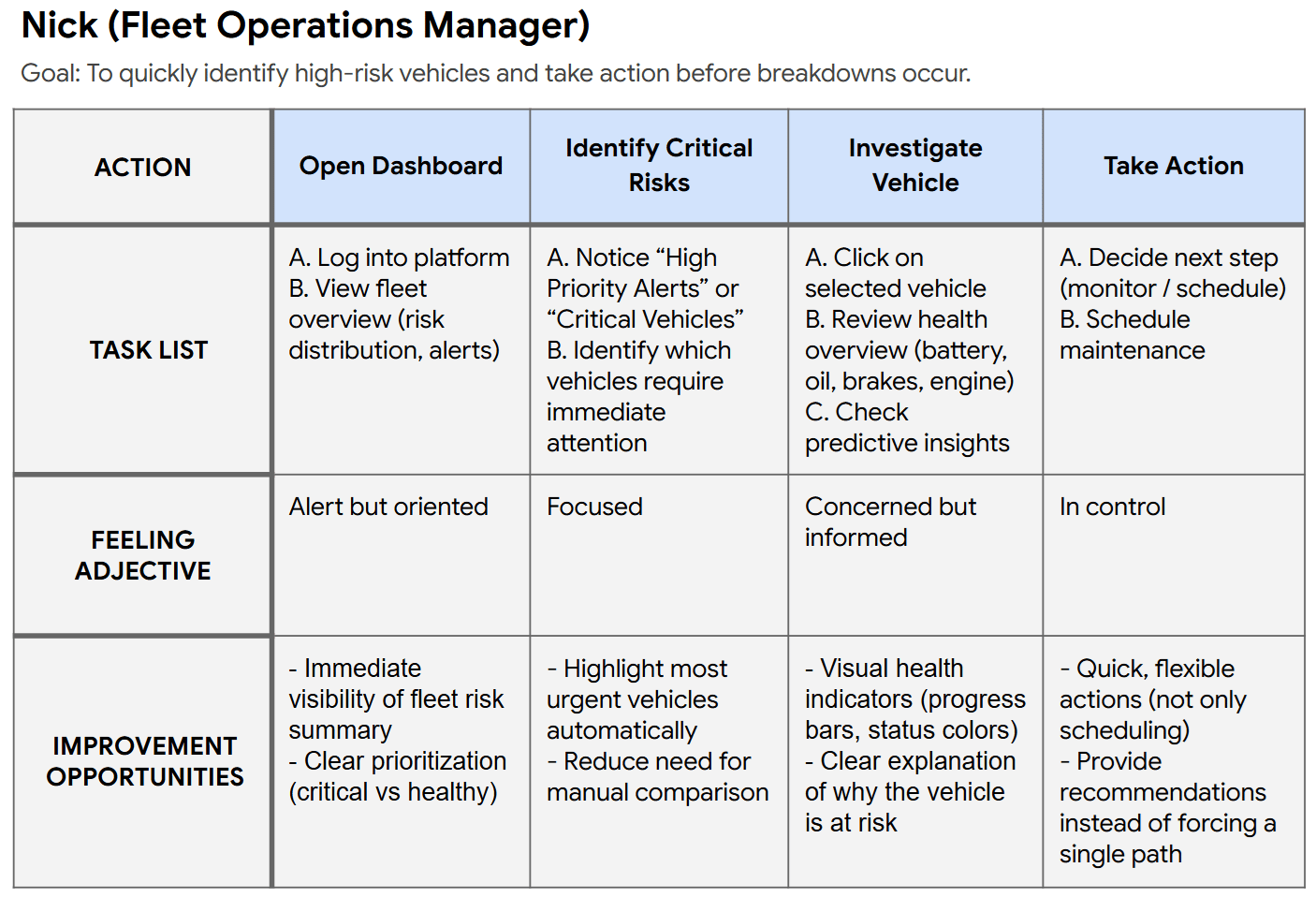
This journey maps how a fleet operations manager moves from an initial risk signal to a scheduled service — from the first alert on the dashboard, through investigation in Vehicle Details, to a confirmed appointment in the Service Planner.
User Flow
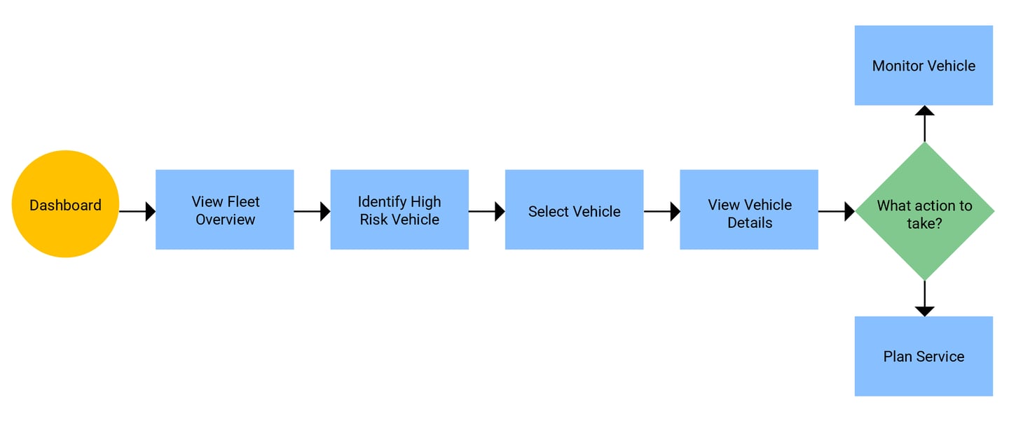
This flow illustrates how Fleetora guides users from risk detection to maintenance scheduling through a structured, low-friction process.
Information Architecture
The platform is structured around six views, each serving a distinct role in the manager's decision workflow:
Dashboard — fleet-wide health at a glance. The start of every morning.
Fleet List — all vehicles ranked by risk, filterable and sortable. For triage at scale.
Vehicle Details — the complete picture of one vehicle. For understanding before acting.
Alerts Log — every active issue, organized by severity and date. For systematic triage.
Service Planner — a weekly calendar of scheduled maintenance. For planning ahead.
Map — geographic positions with severity indicators. For spatial awareness.
The navigation order mirrors the natural flow of a manager's day — overview first, then drill down, then act. Each page is also fully functional as a standalone entry point.
Design Decisions
The dashboard as a question, not a summary
The dashboard is organized around one question a manager actually asks every morning: do I need to change my plans for today? Every element answers part of it — stat cards show counts and daily trends, the health distribution bar shows fleet-wide proportion by severity, the critical alerts strip shows what needs action today specifically, and the trend charts show trajectory over the past week. Sections that couldn't contribute a distinct answer were moved to their dedicated pages rather than summarized here.
Color as a system
The four severity states — Critical, Warning, Predictive, Healthy — own their colors exclusively throughout the product. Coral, amber, blue-slate, and teal appear only to communicate severity. Charts, calendar events, map pins, and progress bars all use neutral tones. Once a manager learns that coral means critical, every coral element in the product is immediately understood without reading it.
Alerts: active versus resolved
Active and resolved alerts are separated into tabs rather than mixed in a single filtered table. The default view always shows only what currently needs attention. The resolved tab exists for reference but isn't the starting point — because a manager opening the Alerts Log is almost always there to act, not to review history.
Sort order as a design decision
The Fleet List defaults to sorting by risk score, highest first. The most critical vehicles appear at the top without any interaction. This sounds like a small detail but it defines the product's posture: it takes a position on what matters rather than presenting vehicles in an arbitrary order and leaving prioritization to the user.
Connecting detection to action
Plan Service appears as an action anywhere a vehicle surfaces with an actionable alert — in the Fleet List, Alerts Log, Vehicle Details, and Map pop-up. The modal triggered from any of these entry points pre-fills vehicle context, reducing the steps between identifying a problem and scheduling its resolution.

