Nami.org Improvement
Improving Cognitive Accessibility
A focused redesign of the Anxiety Disorders page and navigation, aimed at simplifying information, reducing cognitive load, and improving clarity for users seeking mental health support.
The Problem
Mental health platforms often contain large amounts of important information, but the way this information is presented can make it difficult to process — especially for users already experiencing stress or anxiety.
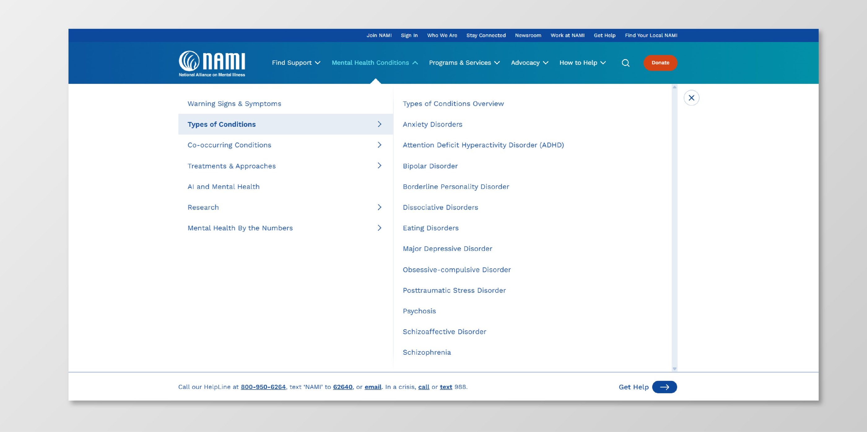
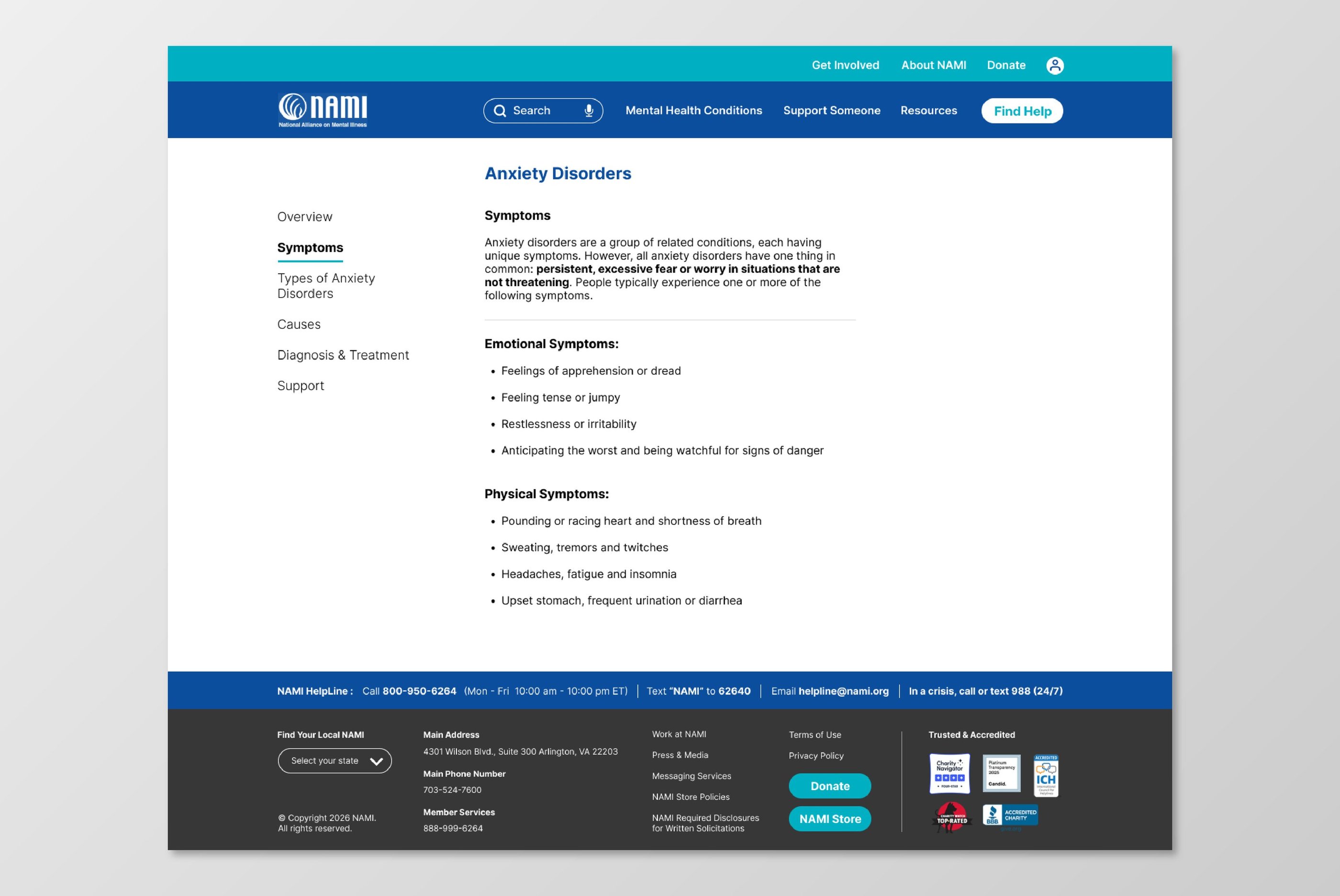
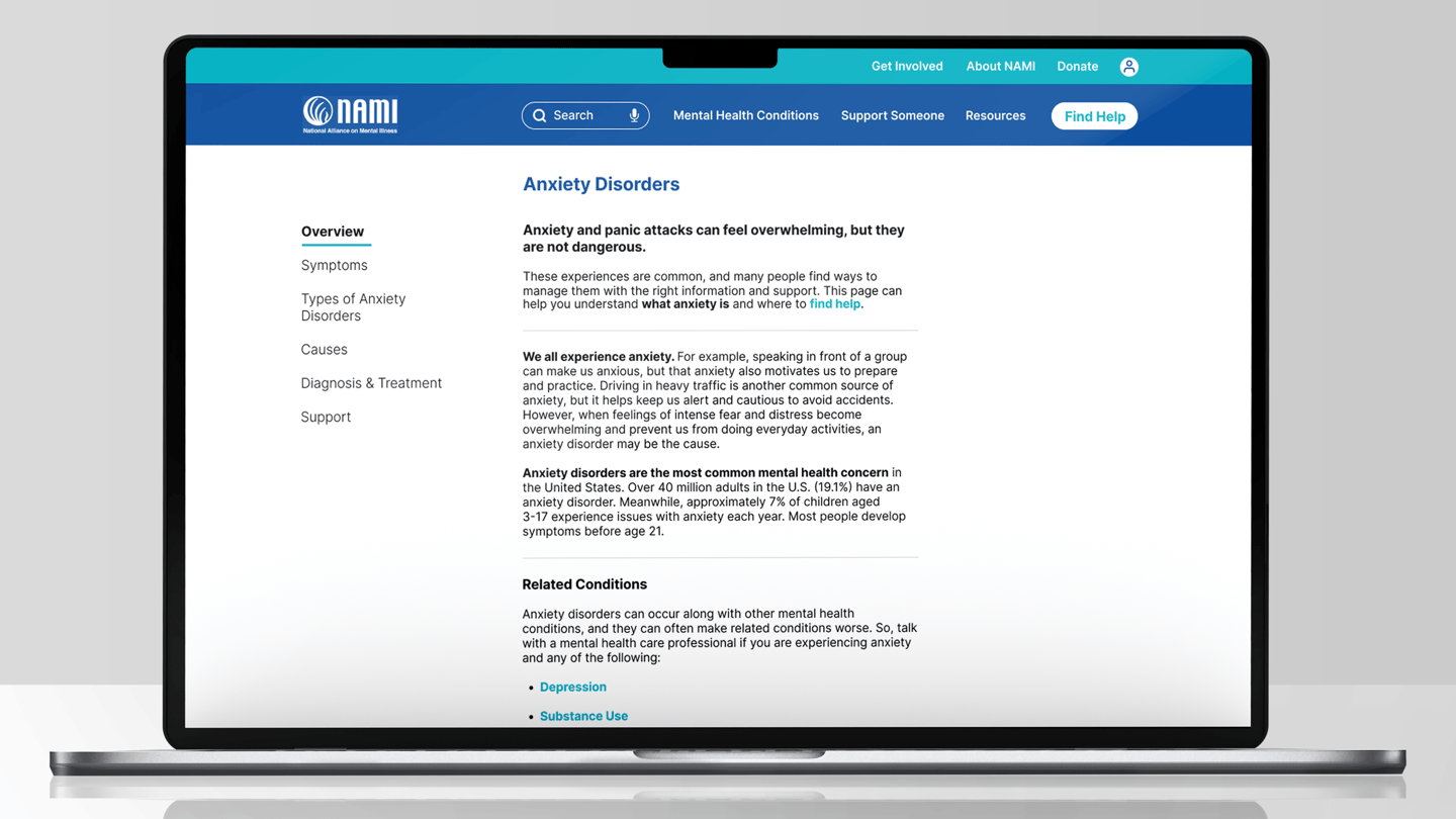
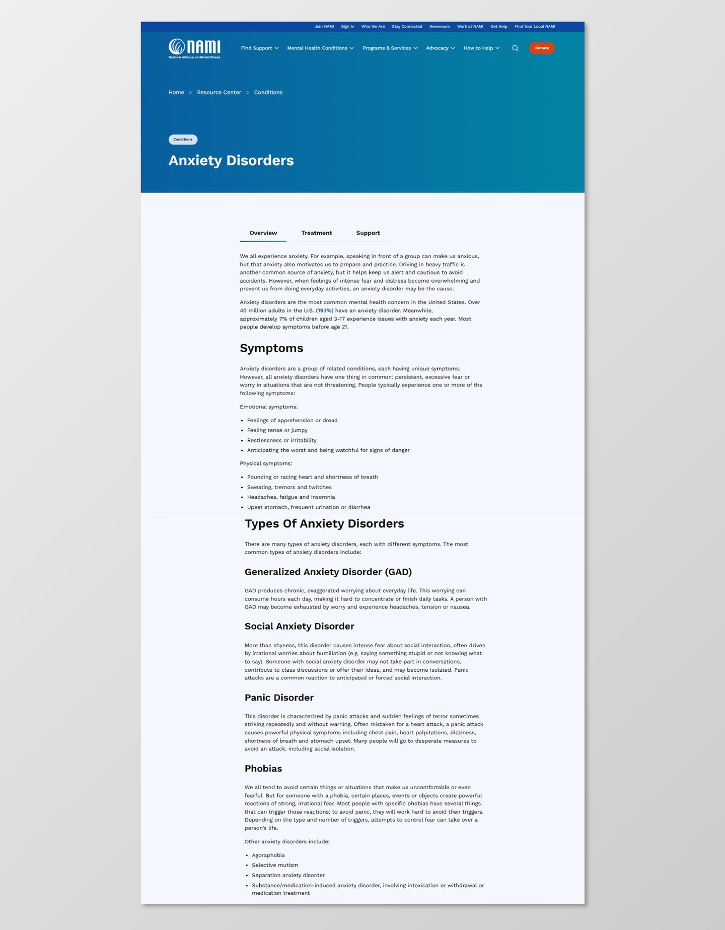
On NAMI.org, the Anxiety Disorders page and navigation include dense text, unclear hierarchy, and overwhelming menu structures.
This makes it harder for users to quickly find what they need, understand their options, and feel supported during a potentially vulnerable moment.
I wanted to explore how improving structure and clarity could make the experience feel more approachable, readable, and supportive.
The Solution
I redesigned the Anxiety Disorders page and navigation with a focus on cognitive accessibility, aiming to make information easier to read, understand, and navigate.
The approach was centered around simplifying structure, improving hierarchy, and reducing visual and mental overload.
Instead of presenting large amounts of information at once, the content is organized into clear sections, allowing users to process it gradually and find what they need without feeling overwhelmed.
Key Concept - Reducing Cognitive Load
The key idea behind the redesign was to reduce cognitive load by breaking information into smaller, structured sections and improving overall navigation clarity.
The menu was reorganized to group related content more logically, while the page layout introduces clearer hierarchy, spacing, and visual separation between sections.
This allows users to focus on one piece of information at a time, making the experience feel calmer, more readable, and more supportive.
Shipping
Check it out : https://tinyurl.com/namiredesign
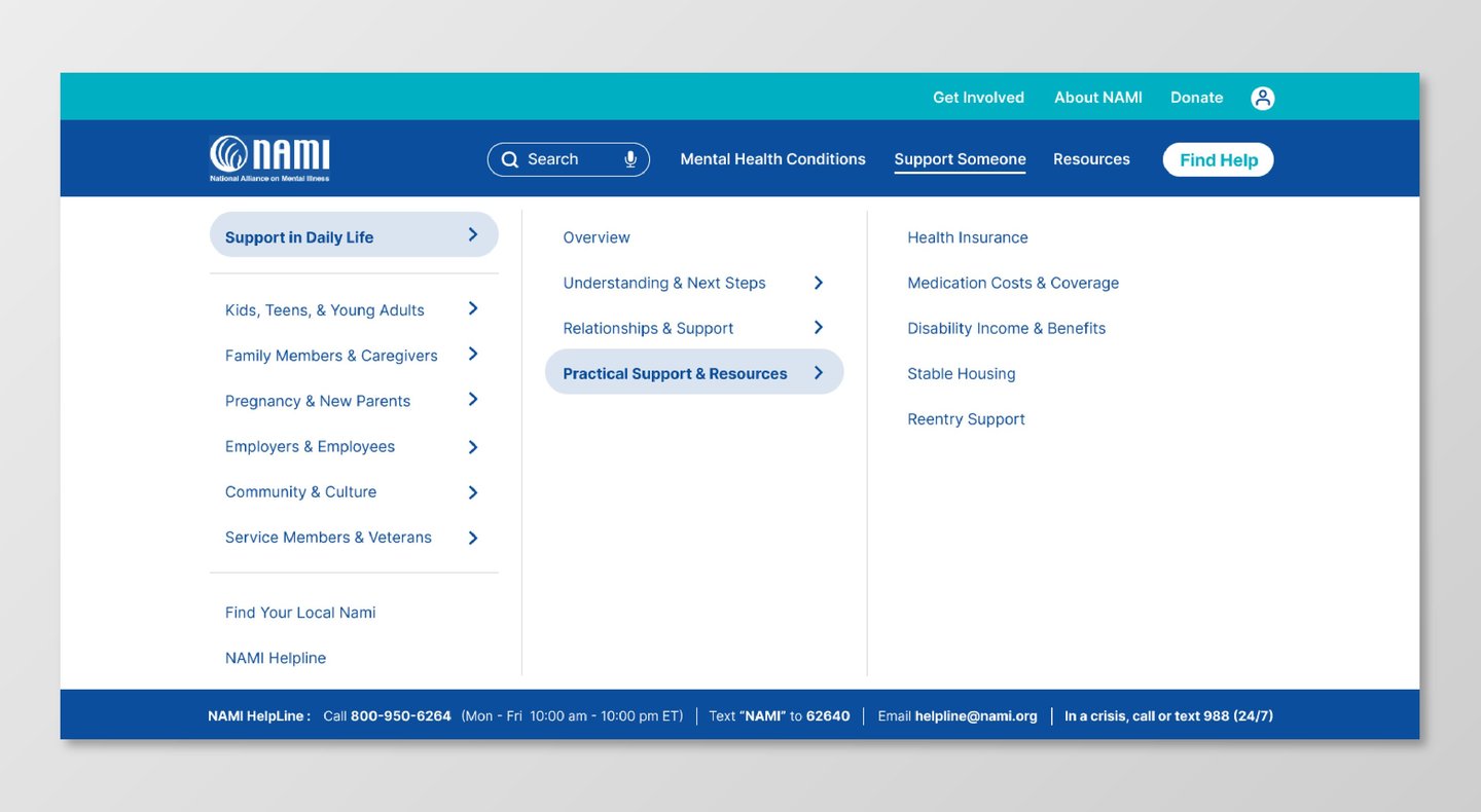
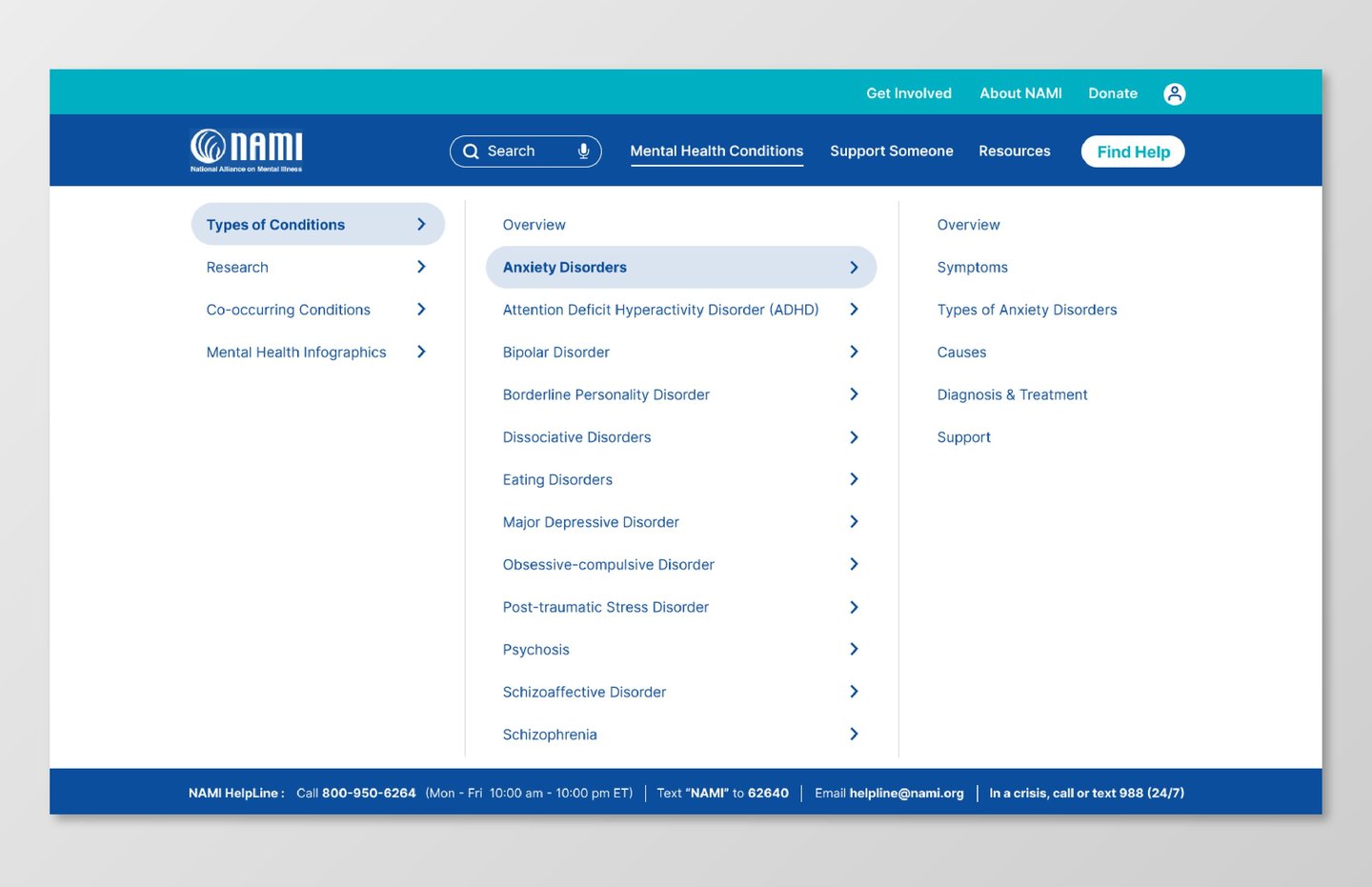
Navigation
The navigation was simplified and reorganized to make it easier to understand and scan.
Content is grouped into clearer categories, reducing the number of competing options and helping users find relevant information more quickly.
Reflection
This project helped me better understand the importance of designing for cognitive accessibility, especially in sensitive contexts like mental health.
One of the main challenges was simplifying complex and information-heavy content without losing its meaning or usefulness.
It pushed me to think more carefully about how users process information, particularly when they may already feel overwhelmed.
Overall, it strengthened my ability to design interfaces that feel not only clear and structured, but also calm and supportive.
The User
The primary user is someone seeking information about anxiety, often while already feeling overwhelmed, stressed, or mentally fatigued.
In these situations, users may have reduced attention, difficulty processing dense content, and a lower tolerance for complex navigation.
Their main goal is to quickly understand their condition, find relevant support, and navigate information without feeling confused or overloaded.
Designing for cognitive accessibility means reducing friction, simplifying structure, and presenting information in a way that feels clear, calm, and manageable.
Current Experience
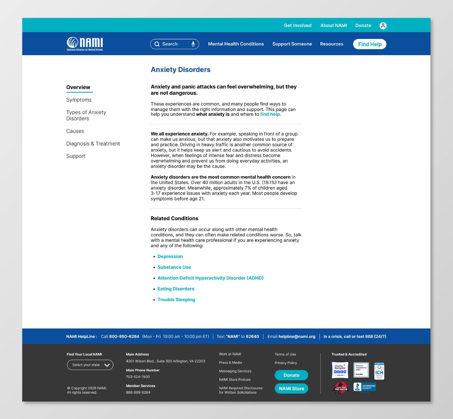
Content Structure
Content is structured into distinct sections with clear headings and spacing, allowing users to navigate through information gradually.
This reduces the feeling of being overwhelmed and supports better comprehension.
The "Find Help" CTA is in a prominent position so that the user can easily reach out.