Nami.org Improvement
UX Redesign — Designing for Cognitive Accessibility
When someone is searching for information about anxiety, the last thing they need is a website that adds to their overwhelm. This redesign of NAMI.org's Anxiety Disorders page and navigation focuses on one thing: making critical mental health information genuinely accessible to the people who need it most.
The Problem
Mental health platforms carry some of the most important content on the web — but dense text, cluttered navigation, and unclear hierarchy can make that content difficult to reach, let alone absorb.
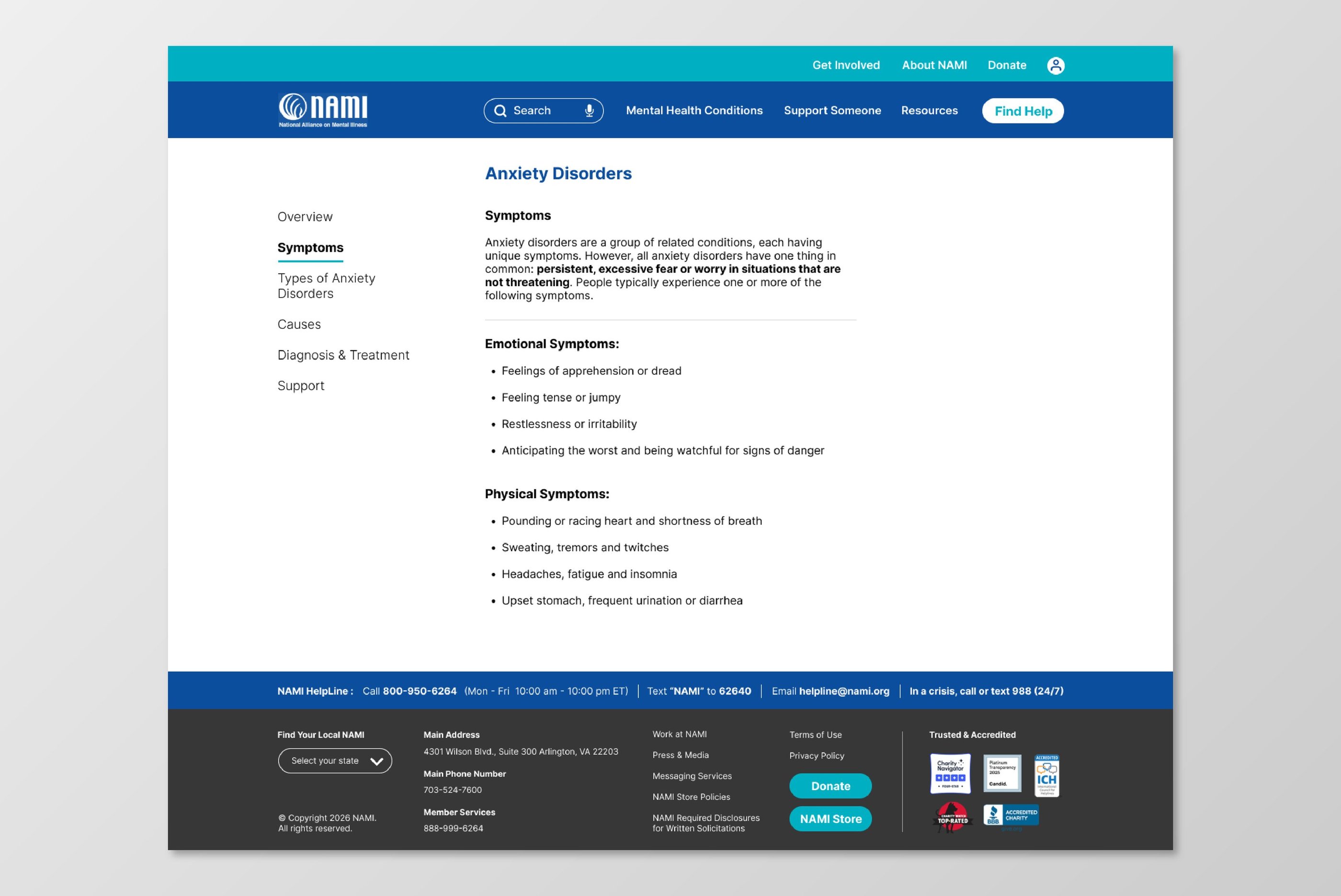
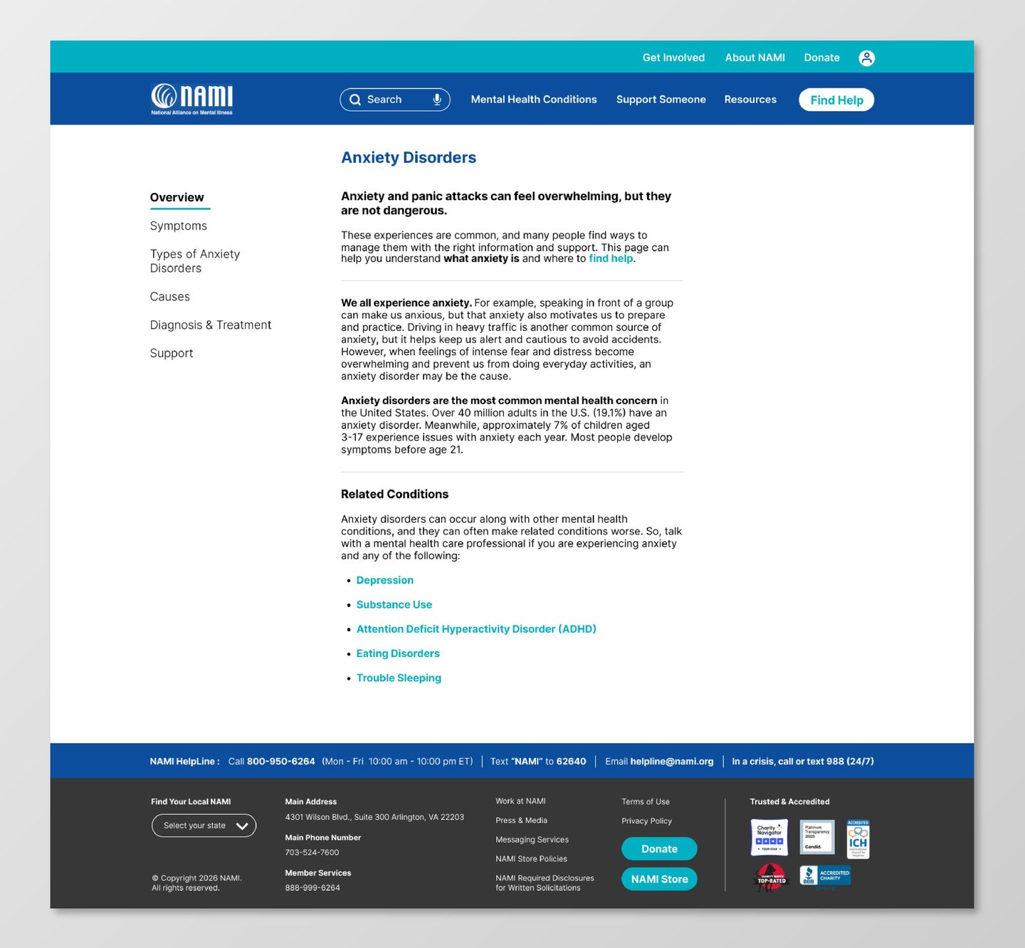
On NAMI.org, the Anxiety Disorders page presents users with an information-heavy layout that doesn't account for who's reading it or how they're feeling when they arrive. For someone already experiencing stress, anxiety, or mental fatigue, a page that demands effort to parse isn't just frustrating — it's a barrier to getting help.
The Solution
I redesigned the Anxiety Disorders page and navigation with cognitive accessibility as the primary lens — not just visual clarity, but the felt experience of reading and navigating the content.
The approach centered on three things: breaking dense content into digestible sections, restructuring navigation to reduce decision fatigue, and creating a visual rhythm that feels calm rather than overwhelming.
The goal wasn't to remove information. It was to make the same information easier to encounter.
Key Concept - Reducing Cognitive Load
The central design principle was to present one idea at a time, rather than everything at once.
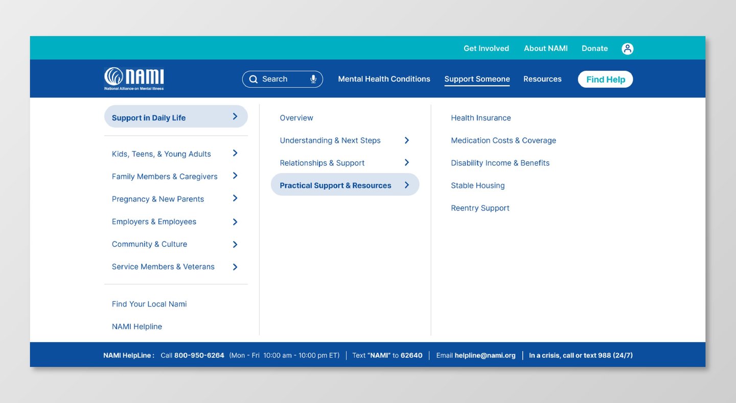
The navigation was reorganized to group related content more logically, reducing the number of competing options a user has to evaluate simultaneously. The page layout introduces clearer hierarchy, generous spacing, and distinct visual separation between sections — so users can move through the content gradually, at their own pace, without losing their place.
The result is an experience that feels calmer to read — which, for someone seeking mental health support, is itself a form of care.
Shipping
Explore the live prototype here
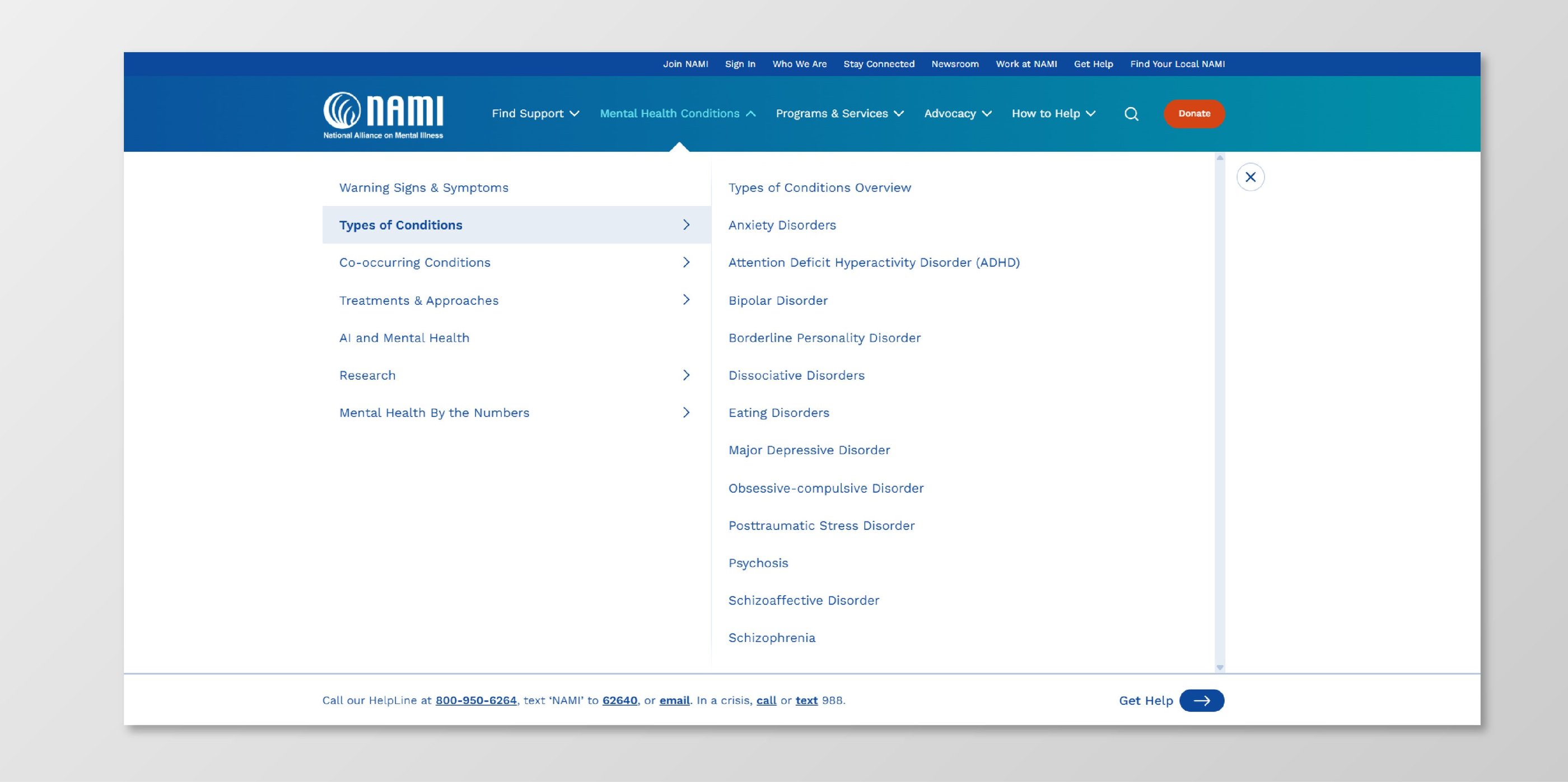
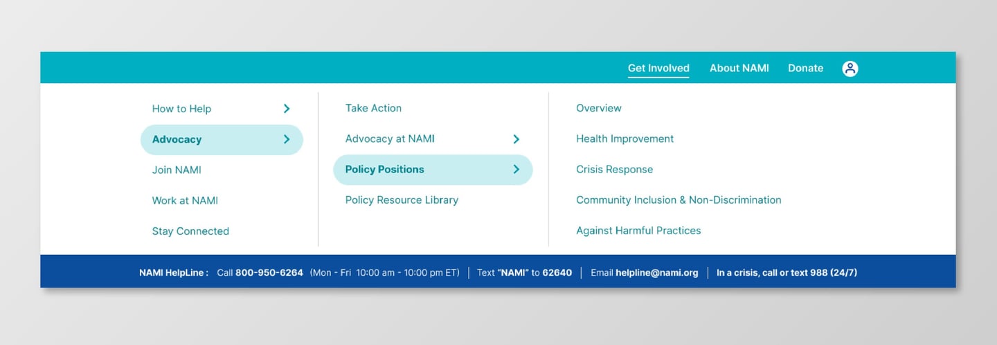
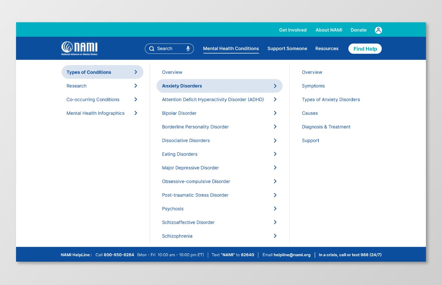
Navigation
Simplified and reorganized into clearer categories, reducing the cognitive cost of finding relevant information. Fewer competing options means less scanning, less second-guessing, and faster access to what the user actually needs.
Reflection
This project was the most context-sensitive design challenge I've worked on. The subject matter isn't abstract — it directly affects how I had to approach every decision.
Designing for users in a vulnerable mental state means the usual trade-offs shift. Density that might be fine in a productivity tool becomes actively harmful here. Visual complexity that's acceptable in other contexts can feel exhausting when someone is already struggling to focus. Every structural decision carries emotional weight.
The hardest part was simplifying without flattening — preserving the depth and nuance of NAMI's content while making it genuinely accessible to someone who might be reading it at their lowest. That balance is where this project pushed me hardest, and where I learned the most.
The User
The primary user is someone looking for information about anxiety — often while already feeling overwhelmed, stressed, or mentally depleted.
In this state, users have reduced capacity for processing dense content, lower tolerance for confusing navigation, and a greater need for structure and calm. They're not browsing casually — they're looking for clarity and reassurance.
Their main goal: quickly understand their condition, find relevant support, and navigate the site without feeling even more confused or overloaded.
Designing for this user means treating cognitive accessibility not as a nice-to-have, but as a core design requirement.
Current Experience
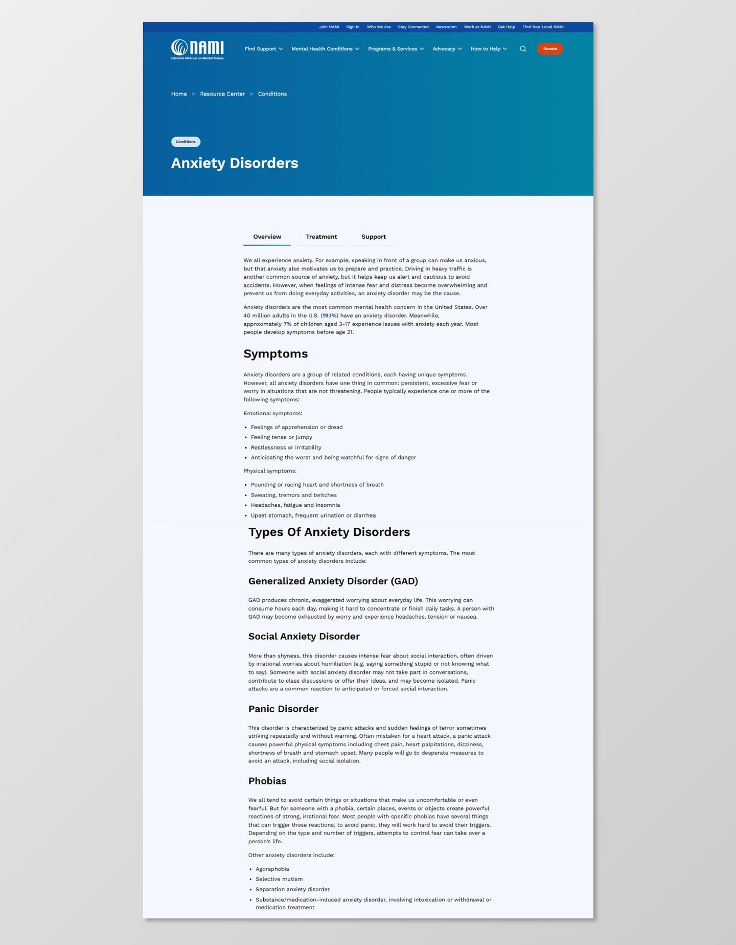
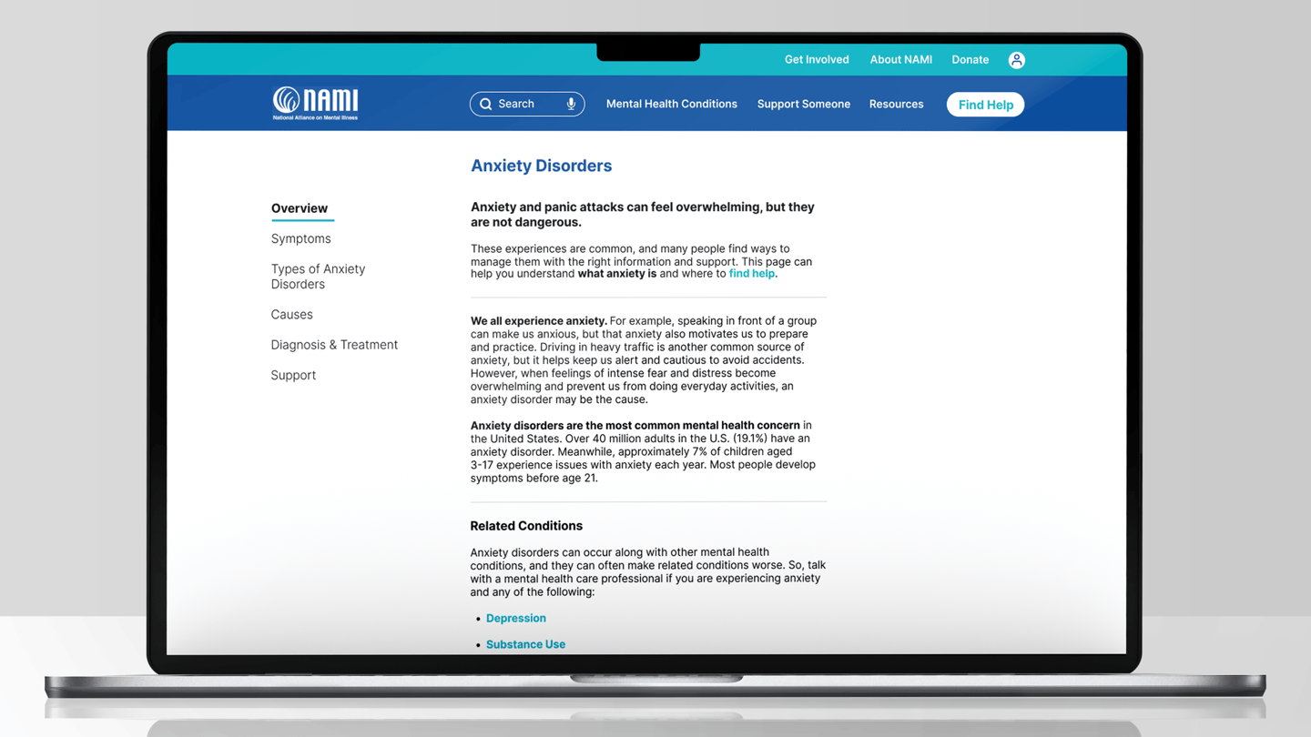
Content Structure
Information is divided into distinct sections with clear headings and breathing room between them — allowing users to process one piece at a time rather than facing a wall of text. The "Find Help" CTA is prominently positioned throughout, ensuring that the path to support is never more than a moment away.