Skroutz Checkout Improvement
Improving Clarity & Flow
A UX redesign of the app checkout experience, focused on reducing friction, improving information hierarchy, and making the purchase flow clearer and more intuitive.
The Problem
The checkout flow contains all the necessary information, but it lacks clear structure and prioritization.
As a result, users are required to process too much information at once, making the experience feel heavier and less intuitive than it should be.
Overall, the experience works functionally, but it could be significantly improved by simplifying the flow and clarifying what matters at each step.
The Solution
I redesigned the checkout flow to create a clearer, more structured experience that guides users step-by-step toward completing their purchase.
The focus was on reducing cognitive load, improving information hierarchy, and removing unnecessary distractions during checkout.
Instead of presenting all information at once, the flow breaks the process into clear stages, helping users understand what they need to do at each step.
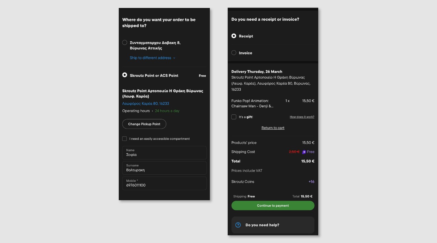
Key Concept - Guided Checkout Flow
A key idea behind the redesign was to introduce a step-by-step checkout flow that clearly communicates progress and reduces friction.
A visual progress indicator at the top of the screen helps users understand where they are in the process (Shipping → Payment → Overview), making the experience feel more controlled and predictable.
This transforms checkout from a dense, overwhelming experience into a guided flow focused on completion.
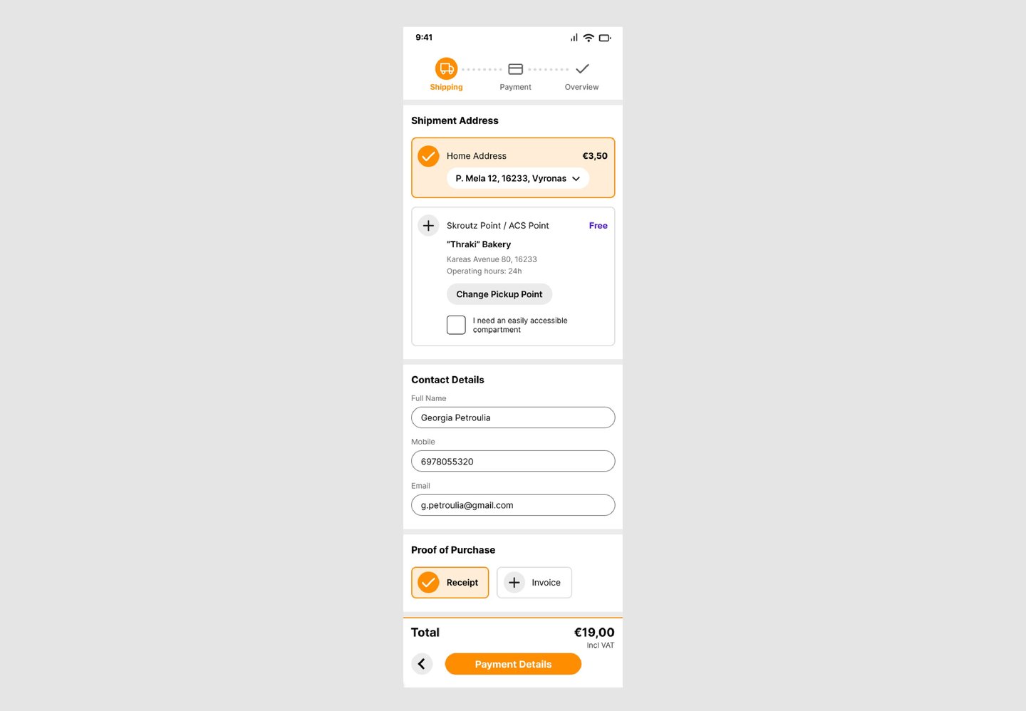
Shipping
The shipping step organizes delivery, contact details, and receipt options into clearly defined sections.
The introduction of the progress indicator helps users understand their position in the flow, while the layout reduces visual clutter and improves scanability.
Check it out : https://tinyurl.com/skroutzcheckout
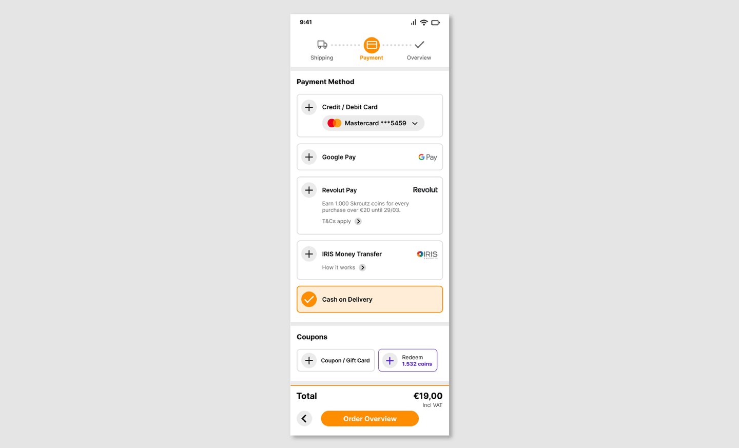
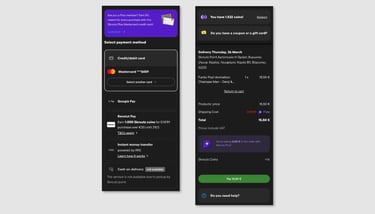
Payment
The payment step presents available payment methods in a clear and structured way, allowing users to quickly select their preferred option.
Non-essential elements are minimized, keeping the focus on completing the transaction.
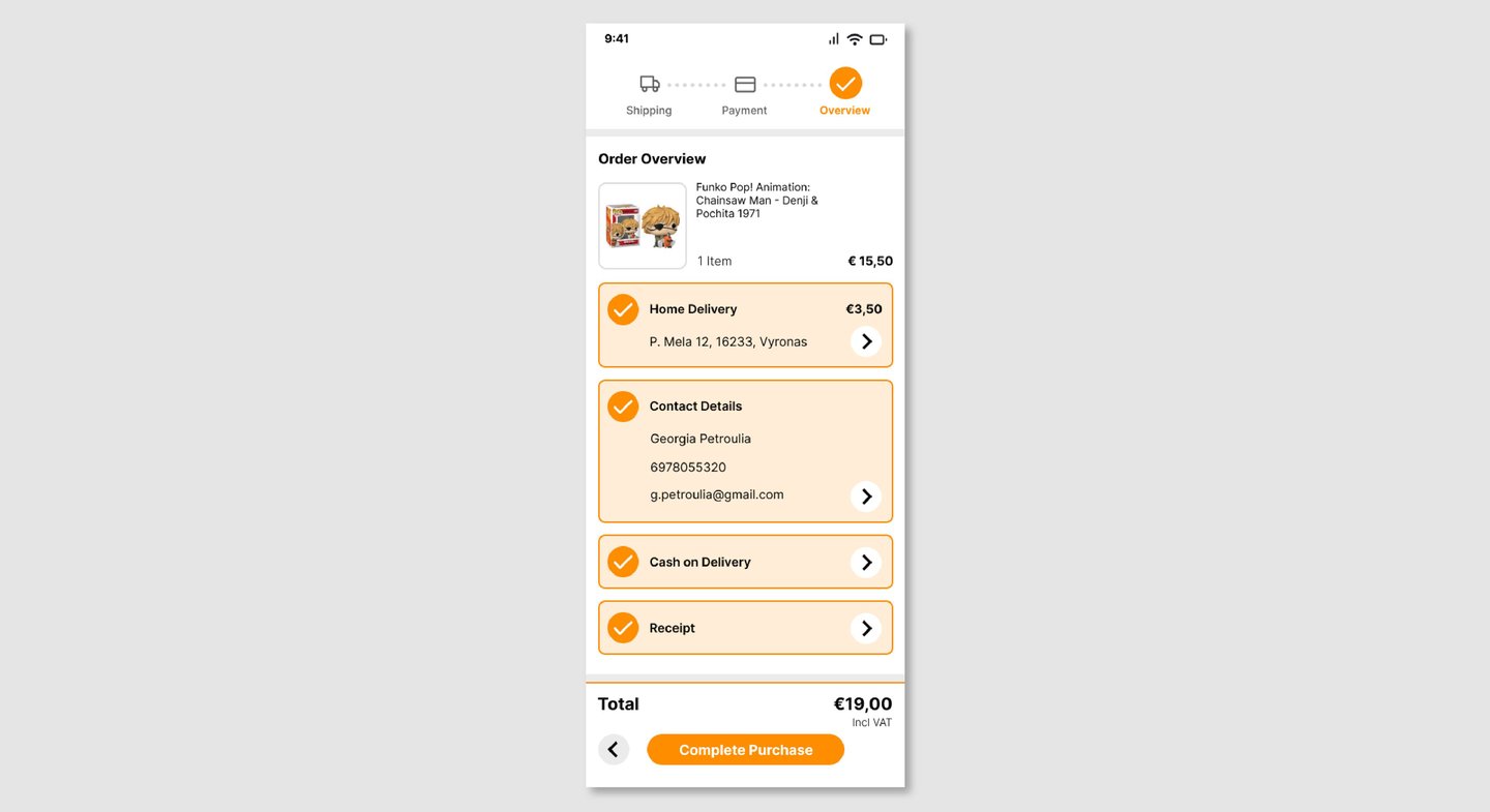
Order Overview
The final step provides a clear summary of all order details, including delivery, contact information, and payment method.
This allows users to review and confirm their purchase with confidence before completing the transaction.
Reflection
This project helped me develop a more critical approach to evaluating existing products and identifying areas for improvement.
One of the main challenges was simplifying a complex flow without removing important information, and finding the right balance between clarity and completeness.
It also reinforced the importance of guiding users through key actions, especially in high-intent flows like checkout, where reducing friction directly impacts completion.
The User
The primary user is someone making a purchase on Skroutz, often quickly and on the app.
They may already know what they want and are focused on completing their purchase with minimal effort and uncertainty.
Their main goal is to complete checkout quickly while feeling confident about their order details, delivery, and payment.
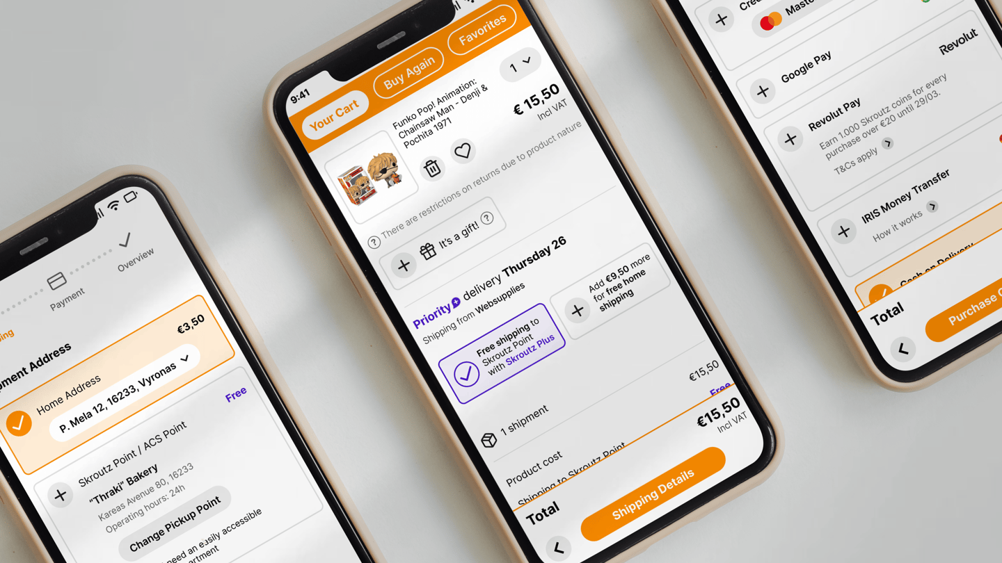
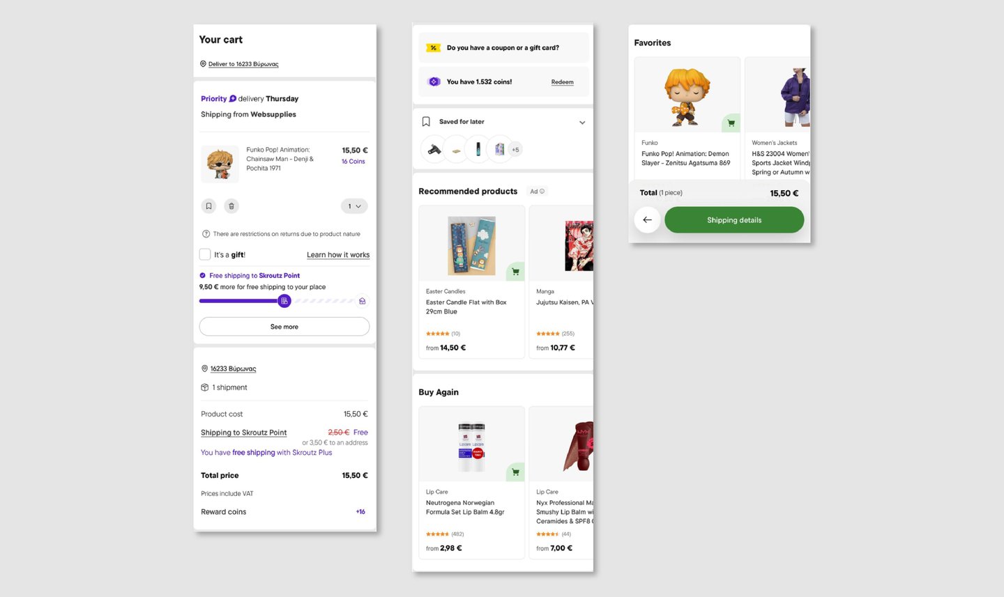
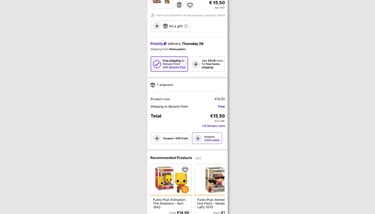
Current Experience

Design Decisions
I introduced orange as the primary action color, aligning with Skroutz’s brand identity and making key actions more visible.
This also helps differentiate primary actions from purple elements, which are associated with Skroutz Plus benefits, reducing visual confusion.
The result is a clearer visual hierarchy where actions, benefits, and information each have distinct roles.
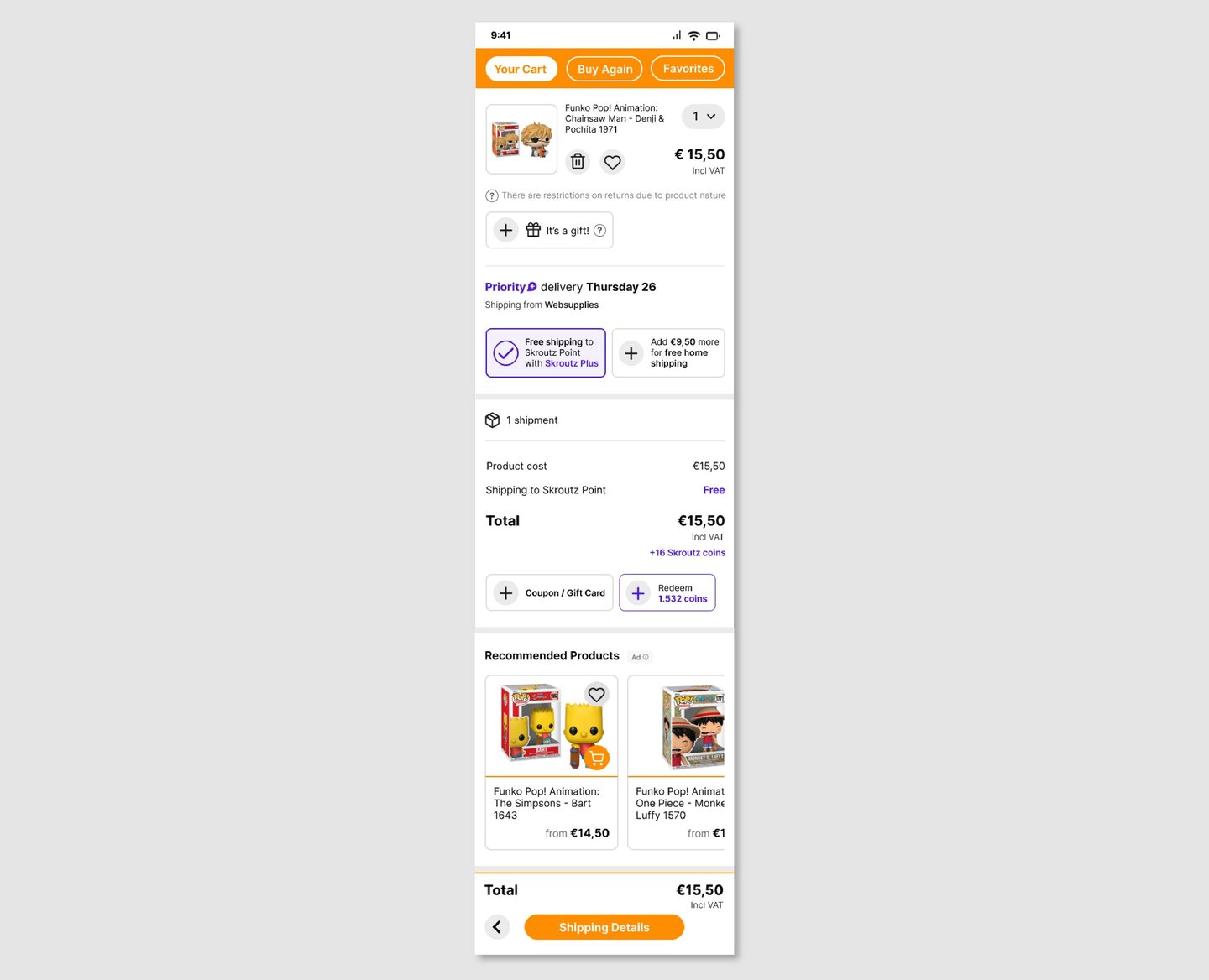
My Cart
The cart was simplified to focus on essential purchase information, such as product details, delivery options, and total cost.
Secondary elements like recommendations are still present but visually separated, reducing distractions during checkout.