Skroutz Checkout Improvement
UX Redesign — Reducing Friction in a High-Stakes Flow
Checkout is where purchasing intent meets its biggest test. This redesign of the Skroutz app checkout focuses on reducing cognitive load, clarifying information hierarchy, and turning a dense, one-page experience into a guided flow that actually earns user confidence.
The Problem
The existing checkout contains all the right information — but presents it all at once, with little structure or prioritization.
Users are forced to process everything simultaneously: delivery details, payment options, contact information, and order summaries compete for attention on the same screen. The experience functions, but it doesn't guide — and in a high-intent moment like checkout, that friction has real consequences.
The Solution
I redesigned the checkout flow to guide users through the process one stage at a time, rather than overwhelming them with everything at once.
The focus was on three things: reducing cognitive load, sharpening information hierarchy, and keeping the user oriented at every step. By breaking checkout into clearly defined stages, the redesign makes each decision smaller, more manageable, and easier to complete with confidence.
Key Concept - Guided Checkout Flow
The core idea was to replace a dense, single-page experience with a structured, step-by-step flow that communicates progress clearly.
A visual progress indicator (Shipping → Payment → Overview) anchors users throughout the process, so they always know where they are and what comes next. This shifts the experience from feeling overwhelming to feeling in control — which, in a checkout context, is the difference between completing a purchase and abandoning it.
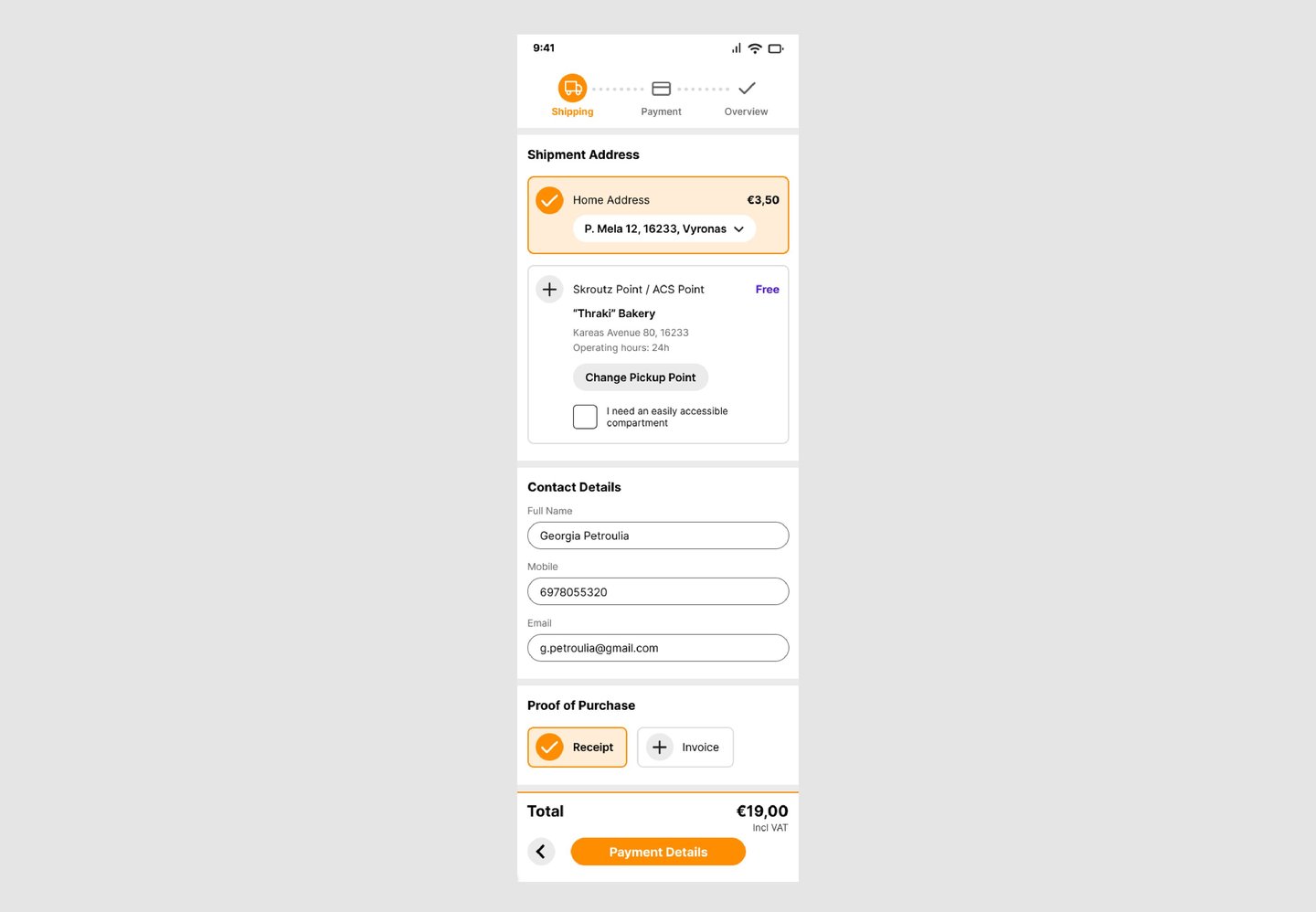
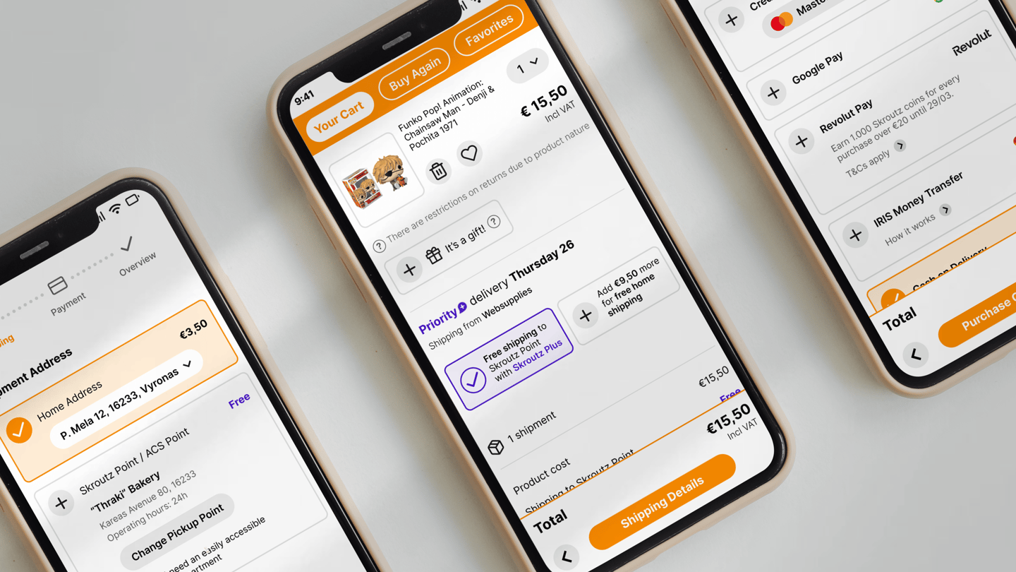
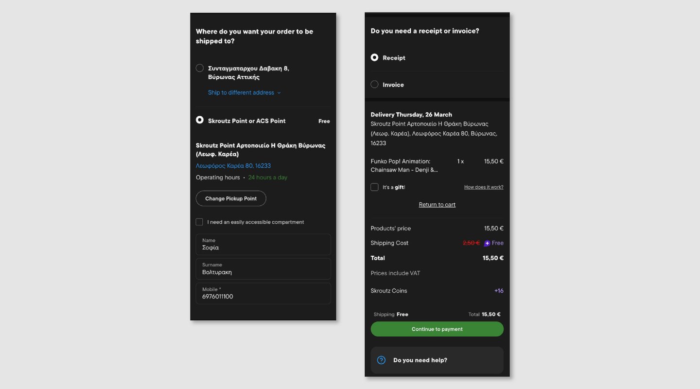
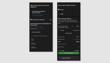
Shipping
Delivery details, contact information, and receipt options are grouped into clearly defined sections. The progress indicator makes the user's position in the flow immediately obvious, and the reduced visual clutter makes the page much faster to scan.
Explore the live prototype here
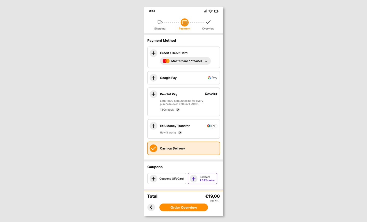
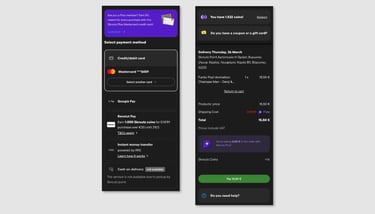
Payment
Available payment methods are presented cleanly, with non-essential elements removed from view. The focus stays on one thing: choosing how to pay and moving forward.
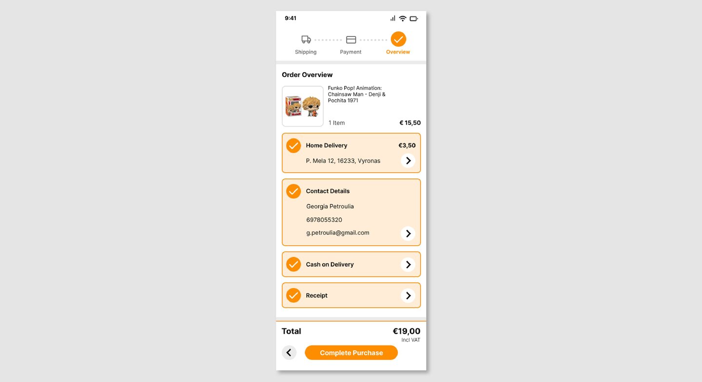
Order Overview
A clear, structured summary of everything — delivery, contact details, payment method — before the user commits. Designed to give users the confidence to confirm, not the anxiety to double-check everything again.
Reflection
This project pushed me to think critically about an existing product rather than designing from a blank slate — which is a fundamentally different challenge.
The hardest part wasn't identifying what was wrong. It was deciding what to keep. Simplifying a checkout flow means resisting the temptation to strip it bare — every piece of information is there for a reason, and the real work is reorganizing it so users encounter the right thing at the right moment.
It deepened my understanding of how visual hierarchy, flow structure, and micro-decisions in layout can collectively determine whether a user completes a purchase or doesn't.
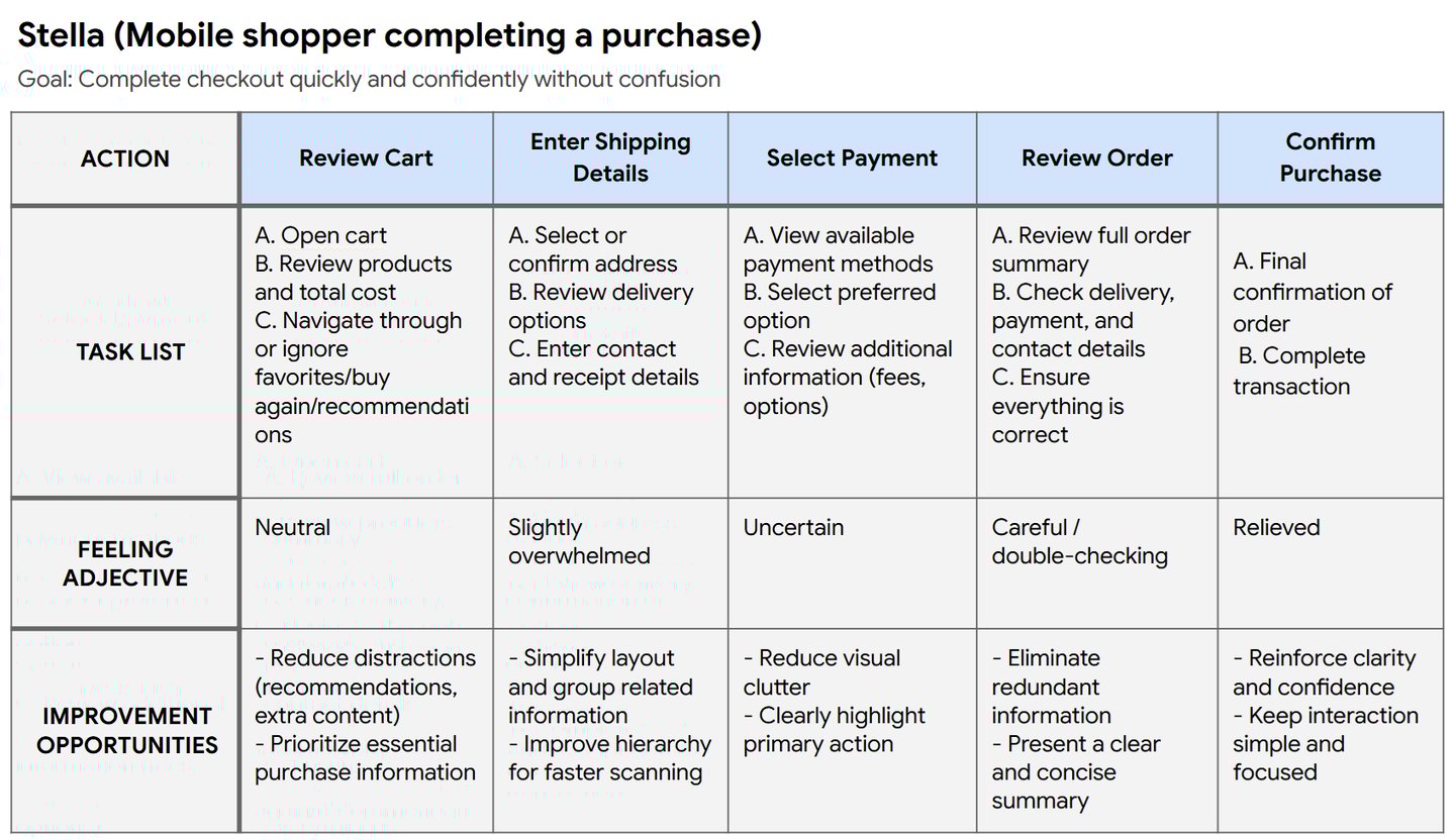
The User
The primary user is someone mid-purchase on Skroutz, usually on mobile, often in a hurry.
They already know what they want. They're not browsing — they're completing. What they need is confidence: that their order details are correct, their payment is secure, and the process won't surprise them.
Their main goal: get through checkout quickly, without second-guessing anything.
Current Experience

Design Decisions
One of the most deliberate visual choices was introducing orange as the primary action color — directly aligned with Skroutz's brand identity — and reserving purple exclusively for Skroutz Plus benefits.
Previously, the mix of colors created ambiguity: it wasn't always clear what was an action, what was a benefit, and what was just information. By giving each a distinct, consistent role, the redesign establishes a visual hierarchy that users can read instinctively — without having to think about it.
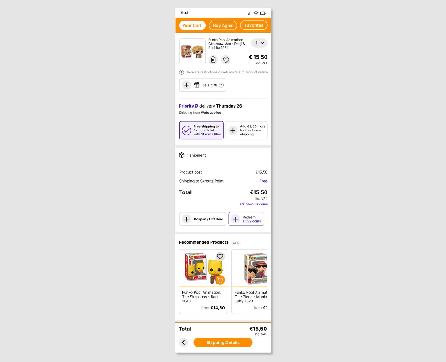
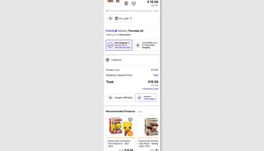
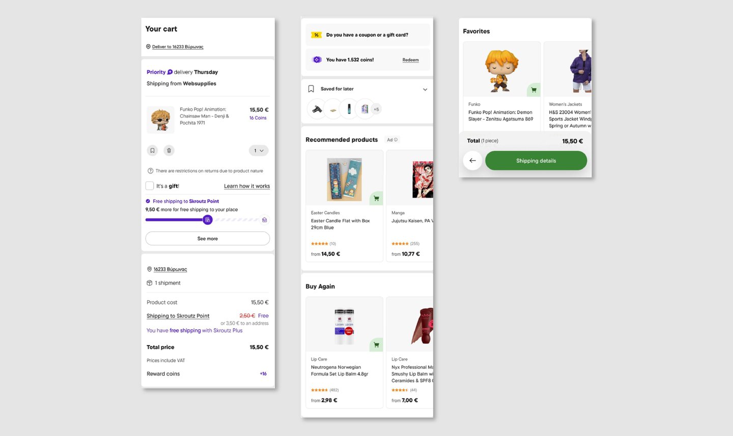
My Cart
Simplified to surface what actually matters: product details, delivery options, and total cost. Recommendations are retained but visually subordinated, keeping the path to checkout distraction-free.
User Journey